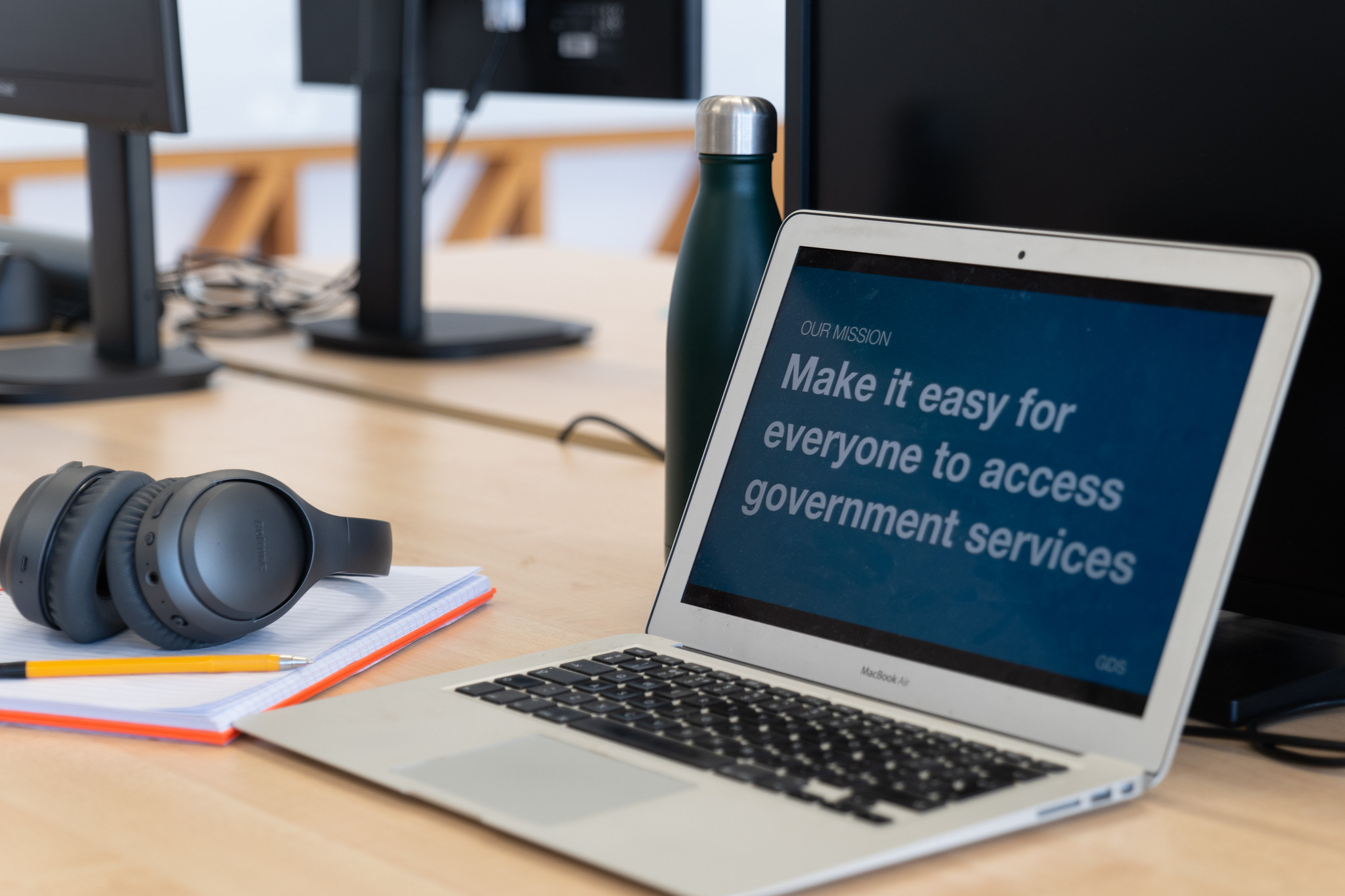
Image courtesy of Government Digital Services.
Our Unlocking Accessibility series focuses on asking various professions or teams specific questions about digital accessibility.
In the first instalment of this series, we asked content designers from various government departments how they initially learned about accessibility and what they wished others would consider when creating accessible content.
Traditionally, Content designers make things easier for people to understand and use. This can involve working on a single piece of content or on the end-to-end journey of a service to help users complete their goal and government deliver a policy intent. Accessibility plays a pivotal role in their every day role.
Question 1 - How did you first learn about accessibility?
Anonymous, Government Digital Services (GDS)
“When I first joined GDS, I attended the accessibility course and that’s when I started to get interested in accessibility. I then joined the accessibility team working on helping government publishers meet the accessibility regulations deadline which is where my interest became an obsession!”
Kerry Lyons, Senior Content Designer, Department for Education (DfE)
“I’d heard through a friend about the work being done to create GOV.UK, so I was having a bit of a snoop. I remember reading something by Tom Loosemoore. He talked about GDS wanting to create the most easy-to-use government website. One that worked for everyone. This, combined with seeing GDS slides (or it might have been the Home Office posters) describing how people could have a temporary, situational or permanent disability was a real lightbulb moment for me. I’d come from a publishing background, where accessibility just wasn’t considered. The idea of giving people what they need, when they need it, and in a way that’s accessible to everyone was a space I knew I wanted to work in. This led me into content design.”
Viktoria Westphalen, Junior Content Designer, HM Courts and Tribunals Service (HMCTS)
“I knew some basics already but only learned more about accessibility, especially digital accessibility, when I joined the civil service about 5 years ago. I started working for the Government Digital Service and was able to attend a few introductory courses on digital accessibility and accessible design, even though I was not working in a design role at the time. During a restructure of my team, I ended up moving to the accessibility capability team which really allowed me to learn about accessibility in more depth – every day was a learning day!”
Charlotte Brewer, Senior content designer and Accessibility lead, Ofsted
“I first learnt about accessibility when I got a job at the University of Bath, 10 years ago. Previously I had created a lot of content, however this was my first 'content design' job.
“Accessibility was baked into this team. Our boss was an ex GDS lead and we worked to AAA standards. It was never questioned and I realised how easily you can exclude so many people.
“When I left that team, I joined others thinking accessibility was standard. However, that wasn't the case. In those teams I took the opportunity to increase my knowledge and share it with everyone I could.”
Georgie Bullen, Senior Content Designer, Home Office
“I have a rare eye condition which has meant I’ve been registered as blind since I was 7. So, although I did not always understand what accessibility meant, I knew from a young age that some things were harder for me to use or access.
“However, my awareness grew significantly when I became a Content Manager at a disability charity. Since then, I’ve made it a personal mission to learn all I can about designing accessible content.”
Helen Nickols, Senior Content Designer, Ministry of Justice - working on the MOJ Design System
“I’ve had a few memorable encounters with accessibility.
“A friend’s parents were deaf and communicated using Irish Sign Language. She explained that she’d never owned a handbag or carried shopping bags because she needed her hands free to communicate. I’d never thought about this need before or how it’d work on a practical level.
“On a personal level, I was once given a hurried diagnosis for tendonitis in both arms following weeks of pain. The GP told me I should not use my hands or arms whilst I waited for physio. I waited at the door on my way out. ‘Anything else?’ he asked. I couldn’t even open the door to leave the room with the advice I’d been given.”
Nikki Hoar, Junior Content Designer, Digital Prison Services, Ministry of Justice
“I first became aware of accessibility when working in a role where I had to include images in blog posts. I knew screen assistive technology existed, but wasn’t aware of how it worked, or how important Alt Text was. After further research I realised there were more steps I could take to make accessible content. Going forward I labelled images, removed emojis and shortened paragraph lengths. These practices helped shape my approach to creating accessible content. I’ve since built on these principles, and I'm committed to discover how to create accessible content for our users.”
Question 2 - What is one thing you wish everyone included when designing accessible content?
Anonymous, Government Digital Services (GDS)
“Inclusive design and accessibility make the product better for everyone regardless of impairment or disability. Accessibility should be at the core of any design. I wish that everyone would start with accessibility.”
Kerry Lyons, Senior Content Designer, Department for Education (DfE)
“One thing? That’s hard. I think writing in plain language. Writing about things in government can sometimes be complex but that doesn’t mean that we cannot write in an accessible way. If we must use certain terms, explain them using language that people understand. And test it - with real people in real-life situations. Can people do the thing they need to do? If they can, it’s plain language, if they cannot, it’s not. As well as being a legal requirement, producing accessible content and services can save time, money and effort, it’s a win for everyone.”
Viktoria Westphalen, Junior Content Designer, HM Courts and Tribunals Service (HMCTS)
“Writing in plain language can be difficult when you’re dealing with specialist terminology or legal jargon. Every content designer has probably worked with stakeholders who do not understand or appreciate the value of plain language. I’ve been told my content would not work for (and might even offend) judges and solicitors because it’s “too simple”.
“It can be hard to push back on, but accessible content benefits everyone. Using plain language helps avoid misinterpretation and users making mistakes because they do not understand something. The legal system should be accessible to everyone – good content is a big part of that.”
Charlotte Brewer, Senior content designer and Accessibility lead, Ofsted
“As a designer, I wish more people understood that there is an art to writing good, accessible content. A lot of people work hard crafting policy documents, or guidance but accidentally make things hard for their users.
“Breaking up text, not making sentences too long, using simpler language is good. This isn't 'dumbing down'. Senior leaders also want easy to read content, especially if they need to read it under pressure.
“Oh and a pet peeve is when headings aren't marked up as headings.
“Personally, I struggle to read graphs and charts, so I love data tables, or explanatory paragraphs.”
Georgie Bullen, Senior Content Designer, Home Office
“A core thing that’s often overlooked is what I’d describe as ‘soft accessibility skills’. By this, I mean things that will not fail in an automated accessibility test - but can make a huge difference in how easy it is to absorb content. This includes things like:
- breaking up blocks of text and long sentences
- writing in plain English
- using sans serif fonts
- avoiding negative contractions
...I could go on!
It is easy to slip into a trap of thinking if something is technically accessible, the job is done - there is so much more to consider.''
Helen Nickols, Senior Content Designer, Ministry of Justice - working on the MOJ Design System
“Alt text, alt text, alt text! The amount of ‘UX leaders’ who post about design whilst failing to add alt text to images is staggering. To me, it’s tantamount to saying that you don’t care about blind and visually impaired people.
“Alt text enables people to understand what an image is conveying. It can also help people with slow internet or technical issues. What’s not to like?”
Nikki Hoar, Junior Content Designer, Digital Prison Services, Ministry of Justice
“Clear and concise content is often the first step in creating accessible experiences. If people feel intimidated by content or don’t understand what it is asking them to do, they won’t engage with it. With government services this could have serious consequences. Users may not access something essential for themselves or for someone in their care. Being mindful about the words we use and how we present content on the page will make our products more accessible to users.”
Read more of our Unlocking Accessibility series.
If you enjoyed reading our Unlocking Accessibility series and would like to contribute to future posts you can reach us at accessibility-in-government-blog@digital.cabinet-office.gov.uk or, if you work in government, on the UK Government Digital Slack.
Please leave a comment if you are a content designer or just interested in the field and would like to give your thoughts on the questions above.


2 comments
Comment by Howard Neal posted on
Thank you...
Comment by Klaudia Grochot-Fraser posted on
Great article - thank you. I used to work as a translator between different languages. Creating accessible content reminds me of my previous work. But now I translate from complex English into plain English. As a non-native English speaker and user of the GOV.UK services, I benefit from accessible content too, all of us do.