The GOV.UK Design System is a library of styles, components and patterns to help teams in the public sector quickly design and build usable, accessible digital services.
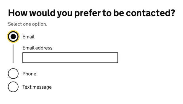
In the radio button and the checkbox components, we offer an option to conditionally reveal fields when the user selects an answer.
They’re often used by service teams to group related questions together, by revealing follow-up questions only when they’re relevant to the user.
In September 2020, the GOV.UK accessibility team found an accessibility issue with conditional reveals. They discovered that users are not always notified when new information, such as a follow-up question, is conditionally revealed, particularly for screen reader users.
This would fail WCAG 2.1 success criterion 4.1.2: Name, Role, Value which requires the user be notified of any changes in user interface components.
To meet accessibility requirements, we added this issue to our accessibility statement and started investigating solutions.
Along the way, we’ve learned more about the problem, what causes it and have worked to make conditional reveals work better for users.
The problem with conditional reveals
To notify users with assistive technology, similar components (such as accordions or dropdown navigation bars) use ARIA (Accessible Rich Internet Applications) attributes.
The `aria-expanded` attribute indicates whether the component has a ‘collapsed’ or ‘expanded’ state to tell the user if there’s new information they need to look at.
Early on, we realised that our use of `aria-expanded` in conditional reveals was not supported for the role of a radio button or checkbox in the ARIA specification.
Other problems to explore
When unpacking the issue presented to us by the GOV.UK accessibility team, we identified that there were in fact 4 areas to investigate.
We saw that many conditional reveals were:
- using the `aria-expanded` attribute as shown in our example, even though it was not supported in radios and checkboxes
- confusing and unpredictable for some users, because they need to understand the relationship between the question and the revealed content
- not perceivable for some users when they expanded or collapsed
- being used to do things they were not designed for
In order to make a decision on whether to remove or keep `aria-expanded` on the label of a conditional reveal we needed to do user research.
User research would also help us test, understand and improve the other usability and accessibility issues we had identified with conditional reveals across services.
We joined with the GOV.UK Pay team to conduct remote user research with assistive technology users. Conditional revealing questions were tested, alongside other components and patterns as part of a complete service journey in the research prototype.
Reaching out to the ARIA Working Group
Our user research confirmed that some users did get notified of the ‘expanded’ or ‘collapsed’ state, despite the attribute being unsupported. We think the notification did help users understand that something was revealed after interacting with the radio or checkbox.
We brought our evidence to the ARIA Working Group. However, they were not sure the notification was needed. They also thought that adding `aria-expanded` might add noise and be distracting. They recommended we gather more evidence that this would actually be useful to users.
We summarised our conversation with the ARIA Working Group on the Github issue discussion page for the radios and checkboxes components.
Solving all the problems, together
The conversation with the ARIA Working Group suggested to us that we needed to think more about the other issues — perhaps the missing notification was not the source of the problem that we’d thought.
Our user research also confirmed to us that all the usability and accessibility issues were indeed interconnected.
Relationship between the question and the revealed content
User research showed us that it was not simply a missing announcement that confused screen reader users. Most users we tested with could tell when something had changed on the page, but they could not understand the layout and journey.
So we knew we needed to improve the relationship between the question and the revealed content.
To explore this, we created 6 prototypes that looked at:
- changing `hint` text
- adding ellipsis points (...) at the end of the answer `label`
- adding hidden text to the `hint` text
- adding hidden text to each answer `label`
- changing where content will be revealed
We also explored alternatives to conditional reveals, such as filter questions and ways of simplifying complex questions.
In future rounds of planned user research, we’ll test some of these changes with users.
How conditional reveals are used
Along with our user research, we looked at how services used conditional reveals.
Looking at both, we concluded that the single biggest issue was that many services used conditional reveals in unexpected ways. We also realised that our guidance did not clearly describe what information can be conditionally revealed.
For example, conditionally revealing text content or multiple form fields complicated the relationship between the question and revealed content.
All users we tested with had no problems completing the task when the conditional reveals were kept to a single input. Other service teams also shared similar findings with us.
We spoke to DAC (Digital Accessibility Centre) who confirmed the issues with using multiple fields or text content (like warning text) within reveals. However, they told us that simple questions with a single input were fine.
What we are doing now
We’ve updated the guidance for radio buttons and checkboxes to give service teams better guidance on how to use conditional reveals, and what to consider.
Finding solutions to meet accessibility requirements of all users is difficult. That’s why WCAG 2.1 is based on principles, not technology and emphasises the need to think about the different ways that users interact with content.
In our research and investigation, we’ve learned that conditional reveals are widely used in services (and in other applications), and it’s clearly an area for us to continue working on.
With our findings in hand, we revisited the notification issue that the GOV.UK accessibility team originally presented to us. The findings supported DAC’s assessment that overall, conditional reveals are fine — as long as they’re kept simple. This was also supported by our conversation with the ARIA Working Group, when they said they did not see the notification as a WCAG 2.1 requirement. In fact, they wanted to see evidence that it’d be useful to users.
Based on this evidence, we’ve removed the issue with conditional reveals from our accessibility statement.
What’s next — help us keep improving conditional reveals
Our work is not over. We’ll continue to explore the problem through user research.
Right now, our conversation with the ARIA Working Group to add `aria-expanded` to radios is on hold as they want to see more evidence before they make a decision. If it decides not to approve our proposal, we’ll remove it from the Design System. Until then we think it’s useful for screen reader users so we’ve left it in.
Help us learn more about conditional reveals
If your service uses these components and you have user research to share, get in touch by messaging the team on the cross-government digital Slack instance or by email. We want to find more ways to make conditional reveals work better for all users.
If you’d like to follow more of our work on this and other areas of the Design System, sign up to get email updates from us.


3 comments
Comment by Chris Leighton posted on
Hello, Do your teams agree that ARIA does nothing for people using vision or touch without audio accessibility assistance? If yes will your 'conditional reveals' provide reasonable design success for those and all users ? It may follow that where vision affected users are not well served that cognitively impaired users are also not well served by the same designs.
ARIA is good for audio users, only. Everything except ARIA needs to provide for non-audio users. Yes?
An analogy. I am reminded of unwanted 10 minute 30 question phone surveys where the last question means I am a disqualified respondent.
Regards, Chris.
Comment by viktoriawestphalen posted on
Hi Chris - please see below the response from the team:
Thank you for your question. Our understanding is that ARIA mostly helps screen reader users, but not exclusively – for example it also affects how speech recognition software understands the page structure.
Conditionally revealing fields on the selection of a radio or checkbox is an established pattern within the GOV.UK Design System. This work was focused mostly on the screen reader experience because that was the issue that was identified.
I think it is possible that the extra field being revealed when the input is checked could be surprising and/or confusing to some users, but it has generally performed well in user research. As has our visual approach where we connect the input and label with a connecting line. We also believe that the fact that the additional fields only appear when they are relevant helps to avoid confusion.
Comment by Iain posted on
Thanks for the info. It could help people to understand exactly what you're referring to, when talking about different ways of doing things and how it happens right now, by showing some images or gifs of things in action.