The Ishihara Test for Colour Blindness
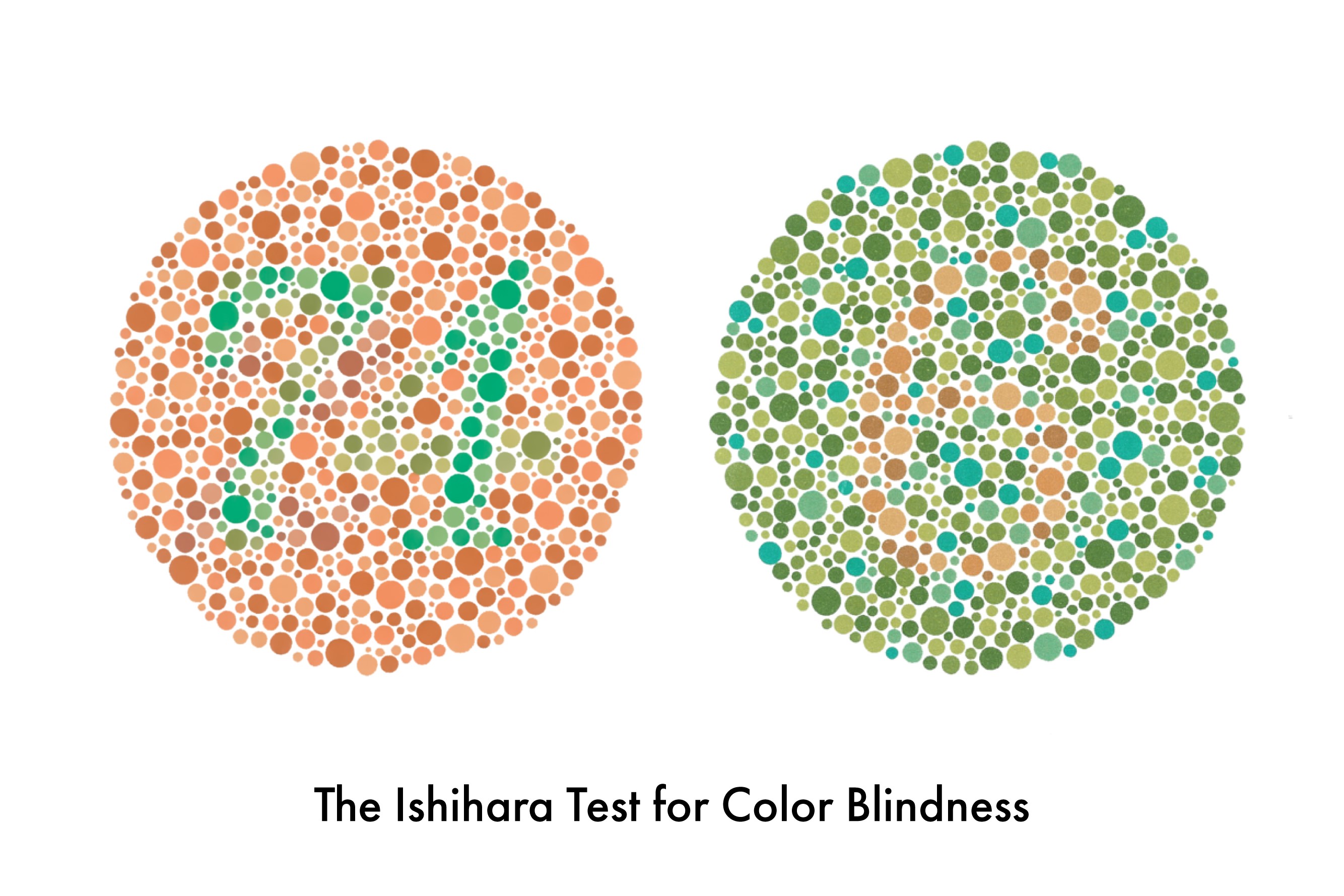
I spent much of my youth buried in paints, pencils and erasers, but it took an innocuous conversation about a yellow car (which was actually green) that made me realise things weren’t quite right in my colour palette. I was subsequently diagnosed with a condition called deuteranopia, where people experience difficulty seeing different shades of red, green and yellow.
Ripe or unripe: my yellow is feeling a little green
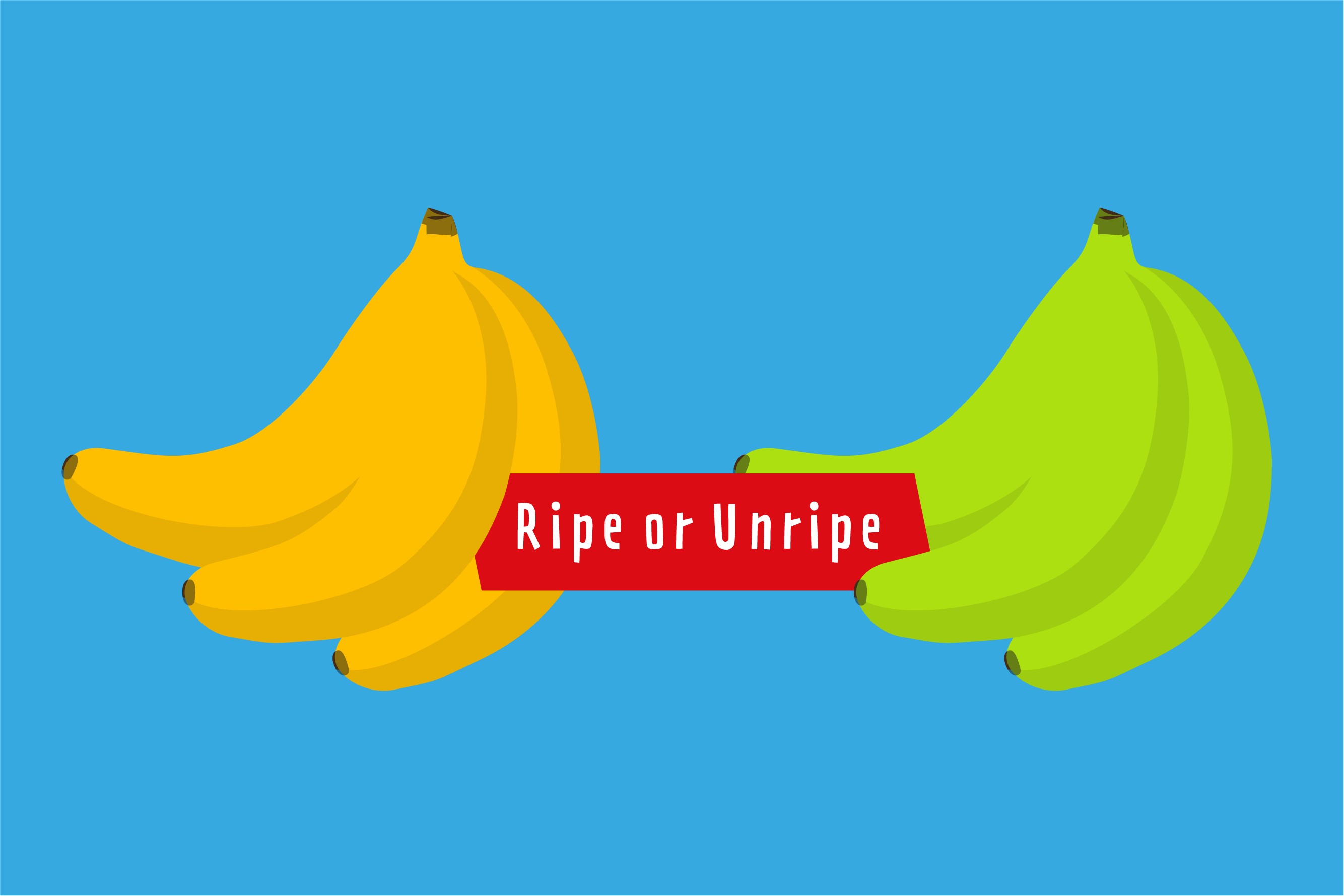
In everyday life, being colour blind brings about challenges which normal sighted people probably aren’t aware of. Like if a banana is ripe or unripe, looking for a red cricket ball in a field of grass, or trying to understand power LED’s because they all appear orange.
Although I studied art at school and graphic design at university, being colour blind always throws up its daily challenges and has affected career choices like not being able to join the Royal Air Force (RAF).
At university I got a truer reflection of what it meant to be colour blind in the world of design. Graphic design uses images and typography to represent an idea, convey a message, or elicit a response. It also relies heavily on the science of colour theory and how humans perceive colour and how colours communicate. This is why it can be beneficial to successful design but a drawback for anyone who is colour-deficient.
My first challenge at university was the mandatory ‘first year’ colour theory module. My professor insisted I do it and use it as an opportunity to compare and discuss my work against my colleagues. Results were amusing to say the least.
I had never before had to actively concentrate on colour and its application within a design context and it was the start of ‘teaching’ myself how I was going to see, treat and use colour going forward.
Passing the employment test with flying colours
If university was the learning, working was the test.
University afforded me a safe space where I could design with freedom and, quite literally, paint over my ‘flaw’. The private sector environment, unless you work within a niche market, leans on organisation and structure and so affords less design hiding places.
I initially didn’t tell anyone in my workplaces that I was colour blind and kept it quiet for years. As a graphic designer, you feel it is expected that you understand all things design, including colour, perfectly. Being a colour blind graphic designer, you feel that you have failed as a designer or that you're not capable or employable.
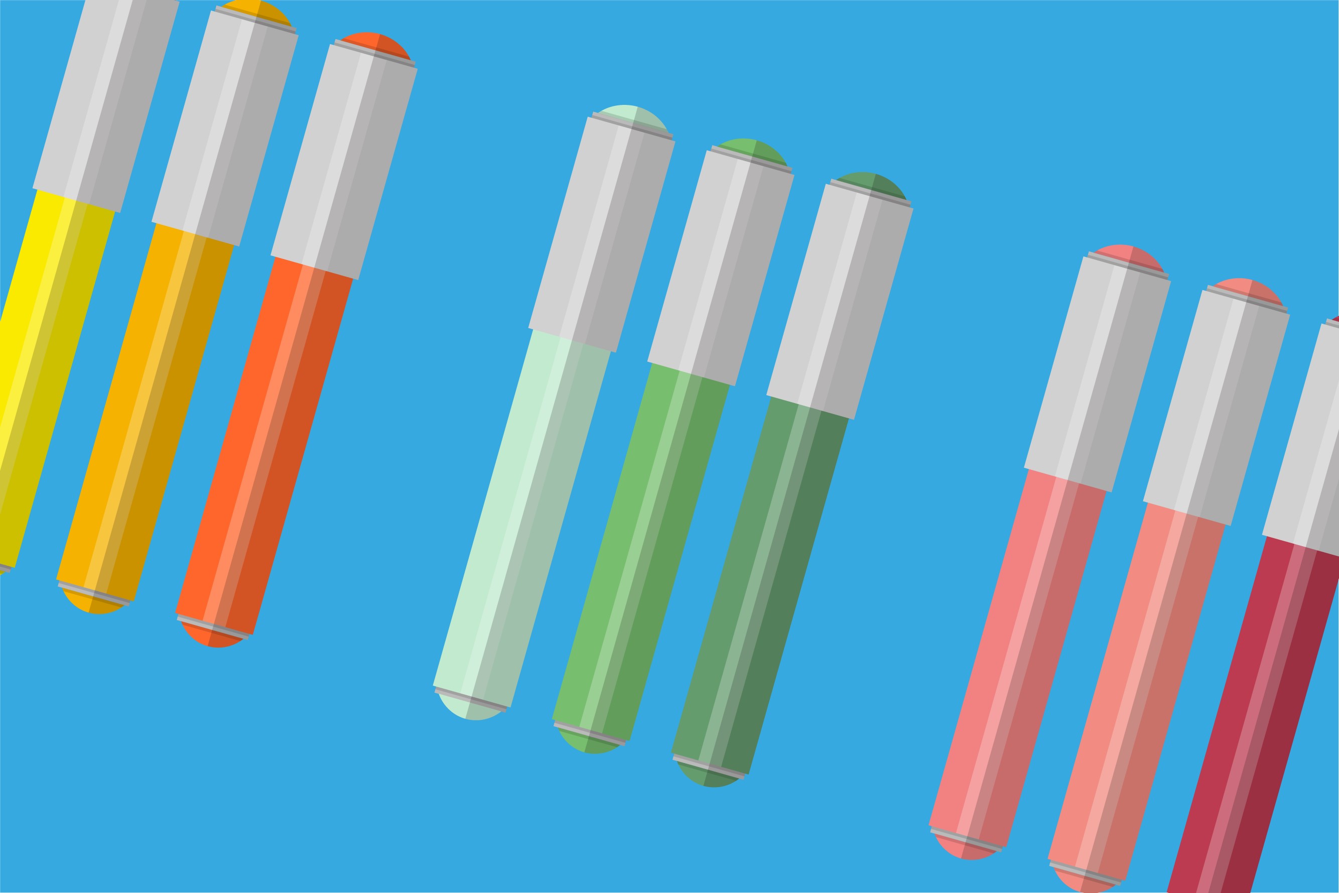
Managers and colleagues did find out over time but by then I had adapted to my environment. COPIC pens were kept banded up in colour bunches to avoid mix-ups. Post-It notes with hex values taped to the side of monitors served as cheat sheets and I built up a library of colour-correct digital material that I could use quickly and easily. I also began to lean on trusted colleagues to be my eyes for anything needing colour correcting.
The move from the private to the public sector at HMRC propelled me to evolve my design lens once more.
Calibrating the design lens

Working in government offers an accepting and transparent environment, where disability and accessibility have an open platform for discussion and acceptance.
Accessibility has exposed me to a new set of design guidelines that encouraged me to have empathy for a completely new audience and discover ideas I might not have thought of previously when creating visual messages. The perception is that with accessibility you automatically put limitations on creativity and have to design ‘simple, boring and safe’. While meeting Web Content Accessibility Guidelines (WCAG) 2.1 AA and legal obligations certainly does limit design in a way, the challenge going forward now lies with designers and visual communicators to think outside the box, but stay within the boundaries of accessibility.
Ironically my first project in government involved doing just this.
HMRC was looking to introduce interactive learning areas (now known as Accessibility Empathy Hubs) within the regional centres to help demonstrate online barriers that users with access needs can face. I was tasked with the concept, design and implementation of these learning areas and the successful result of a playful, thoughtful and creative environment, all designed within accessibility guidelines, proved that this can be achieved.
When I tell people that I’m a colour blind designer, it sparks their curiosity as they are bemused and intrigued by the idea of someone who designs but can’t distinguish colours properly. I can joke about it now but it has taken time to own this and feel comfortable to talk about it, but I feel I am passing the challenge with flying colours.

1 comment
Comment by Stephanie posted on
By not keeping it quiet, you help the discussion and awareness. Thank you for sharing Scott.