We want to share some top tips on writing and using alternative text to encourage everyone to add it into their content every day. Our tips can be applied no matter what software or application you’re using.
Writing alternative text that matters
Images are often used without alternative text (alt text) in documents, newsletters and social media. Chris Jenkins, a civil servant and screen reader user from Department of Environment and Rural Affairs (Defra) described not adding alt text as being like dropping litter.
“People leave out alt text because they forget or they don't think it's important to add it. Well, to me and people in my situation, it’s the equivalent of litter dropping in the sense that people do it. It's not really acceptable, but because other people see other people doing it, they think ‘Well, I can get away with that’ and the problem with that is the screen reader user can't guess at what an image is.”
We want to share some top tips on alt text to encourage everyone to add it into their content every day. Our tips can be applied no matter what software or application you’re using.
A note on terms we use
In the article, we shorten alternative text to alt text. We use this term to include:
- descriptions included in the alt text attribute on web pages
- descriptions included an alt text box in applications
- descriptions of images included on the page
Find out the basics of alt text
If you’re very new to alt text or you’d like a refresher please go through the following resources for an introduction.
- Adding Images and videos to GOV.UK
- What’s the alternative? How to write good alt text by Design102
- How to write alt-text descriptions for image accessibility by Scope
Writing alt text is easy but writing good alt text can be hard
Alt text is one of the easiest techniques to apply but getting it right can be difficult. Writing good alt text is about considering different factors including:
- topic or purpose of the content
- function of the image
- what the user’s goal is
- image contents
- what’s on the rest of the page
Alt text decision trees can help you write better alt text by filtering through common scenarios such as whether the image includes text. Use the tree if you want to improve your skills or to assist you with a more challenging image.
Alt text in action
Let’s explore a some examples of using alternative text in different scenarios.
Add alt text on the page so everyone can access it
Image guidance from GDS (Government Digital Service) suggests you leave the ‘alt text’ empty and write a description of the image in the body text instead. This means the description is then available to everyone. Including alt text on the page removes more barriers because it’s also useful to people with low vision and visual processing disorders.
If you’ve been used to adding alt text as visually hidden content, it might be hard to break the habit and start adding it to the page. To encourage you to do this we want to highlight the positive impact it can have.
We asked content designer and accessibility specialist Marian Avery to tell us why it’s important to include alt text on the page. Marian is also visually impaired and uses a screen magnifier.
“Magnification users often struggle to see images because most images pixelate when enlarged. Lots of visually impaired people may be visiting your page without using assistive technology. This is especially true for older people or people who are newly diagnosed.
You should also consider someone reading your page in bright sunlight - the hardest bits to see are probably the images. Describing them on the page helps everyone.”
Marian shared some practical tips on how to use alt text and text on the page together.
“You can still use the alt text field to tell people that the image is described on the page, and where that description is. This gives reassurance to screen reader users who are used to something being in the alt text field. It's better to use it as a pointer rather than repeating the description and creating 'auditory clutter' for screen reader users.”
Moving from alt text being visually hidden to alt text being visible on the page is an emerging practice. Marian’s advice is slightly different from the GDS guidance to not use the alt attribute at all. We think this is a valid technique to try out until we learn more about user preferences and behaviour.
Marian also highlighted the value of show alt text buttons.
“Platforms like X (formerly Twitter) and Slack make image descriptions for everyone with a visible 'alt' button. Where you don't have that option, image descriptions on the page are the most helpful way to go.”
Alt text and AI using shortcuts for alt text
Adding alt text to lots of images at one time can be time consuming. This might prompt you to start looking at artificial intelligence (AI) to see if it can do your job for you. AI uses image recognition to write a description of the image. It might seem like a simple solution, if the computer can describe my images for me, then why do I need to get involved?
The problem is the computer often provides a very literal description of what the image contains and fails to take into account wider context.
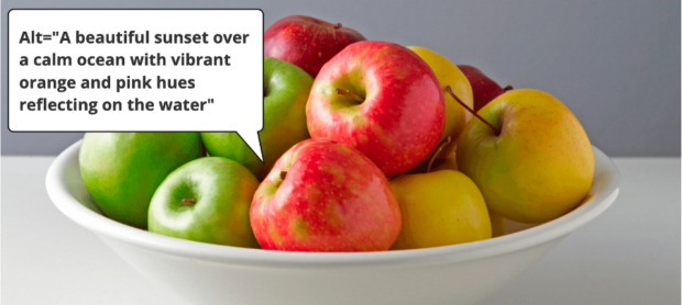
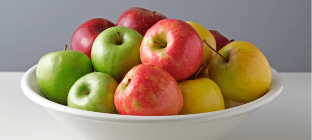
We ran a quick experiment with an online alternative text generator. We picked an image of different-coloured apples, red, yellow and green in a large white bowl.
The alternative text generator produced the following results:
- Fresh red apples in a ceramic bowl on a wooden table.
- A wooden bowl filled with shiny red apples.
- A bunch of ripe, red apples placed in a beige bowl.
- A beautiful sunset over a calm ocean with vibrant orange and pink hues reflecting on the water.
Although the first three descriptions are not incorrect they are also not very accurate. A couple of the descriptions mention a wooden table or bowl but this is not visible in the picture. Also, none of the descriptions mention the green or yellow apples on display. The fourth description is simply incorrect and of no use.
As this experiment shows, human descriptions are more accurate. We are able to describe images using clear and consistent language and take into account the surrounding context.
You may choose to use automatically generated descriptions to draft alt text and then you can manually check that they are correct and appropriate before you publish.
Broadening your reach on social media
Everyone should be able to enjoy quality content online. Adding alt text to your social media posts makes your content more accessible. Here are our alt text ‘must-knows’ for creating high quality and accessible social media content.
- Keep it short and simple - Just describe the image, taking into consideration the surrounding context. There is no need to describe every detail if it has no relevance. Try to keep your alt text around 100 to 200 characters.
- Generally, you should avoid using images that contain any sort of text. Use written content or other alternatives wherever possible.
- Do not use alt text to improve search engine optimisation (SEO). If you can logically work keywords into an image description do it but it is better to use your hashtags and accompanying post text instead.
Flowcharts
A flowchart is a diagram that represents a workflow or process. They aim to guide readers through a complex process in a visual manner but this makes them inaccessible for non-visual readers.
Always include a structured text version of the chart, using headings, lists or a data table. That way there is no need to provide complex alt text, it could simply say: ‘Flow chart for [name of process], full description on page.’
Chris Jenkins explains the importance of presenting data in multiple ways; ‘People often need time to process the complexities or subtleties in charts.The more ways that you can provide the information will help people make sense of that data, whether they are experts or novices’.
Infographics
Infographics are about visual storytelling. They are intended to present information quickly and ‘at a glance’. However, to make them accessible, we recommend a two-step approach: first, write a short description that describes your infographic, keep it brief; then write a long description, communicating all the essential information, including any text that is part of the image.
Chris Jenkins explains ‘If you're looking at inclusion and accessibility then you need to consider all user needs rather than just prioritising the visual. It's important to try and describe that for people who don't have the means to visually access it themselves.’
Don’t drop litter! Write alt text, ideally on the page, so more people can understand images.
Please share this blog post with anyone you know who doesn’t use alt text so they can understand the impact it has on the people who need it.

6 comments
Comment by Martin Jordan posted on
This is such a good and timely blog post!
I immediately shared it with my team. Thanks very much for covering what seems like basics in 2024. This still matters and remains necessary.
Comment by Nicki Berry posted on
Thanks for writing this post! It will be very useful as a resource to share with colleagues.
Comment by Vicky posted on
This touches on something designers have been talking about - how we document screenshots since for sighted people it is actually about being able to read everything that is in the image - it seems like the answer is using both the alt and longdesc, and potentially having to improvise if a language doesn't have longdesc?
Comment by samanthamerrett posted on
Hi there Vicky,
Thank you for your comment.
Yes, there are various ways you could address this but using the long description could work well. You could also add the description into the body copy / main text on the page so there is no need for an alternative description at all.
Comment by Aaron posted on
Thank you for this information, I've never been sure how to write good alt text.
I noticed that the actual alt text of the second bowl of fruit image is 'A while bowl containing green, red and yellow apples." I think it's meant to be 'white bowl'?
Comment by samanthamerrett posted on
Hi Aaron,
We are glad to hear the post was helpful.
Thanks for spotting that typo, we have corrected that now.