Digital Accessibility Specialist Richard Morton encourages developers to dump their mouse for an hour.
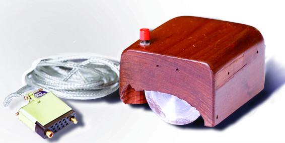
A computer mouse is a great invention: it’s really useful, but it can become an unintended barrier, because designers and developers usually use a mouse or trackpad, and assume that everyone else does too.

Before PCs I just used a computer terminal which only had a keyboard. When I started using PCs, the mouse was a thing of wonder, enabling me to work (and make mistakes) much faster.
Reasons for not using a mouse
What happens if you can't use a mouse effectively or at all: perhaps because of a tremor, or arthritis, or missing limbs, or being blind or visually impaired? You might then have to rely on the keyboard, or assistive technology like speech recognition software, or a switch device, which generally rely on emulating keyboard controls.
Computer keyboard commands
Try working without a mouse or trackpad for just an hour, to see if there are any barriers. If you have a mouse then lock it away and disable your trackpad.

Here are a few keyboard commands you may need:
- tab – move between focus areas on the page, for example links, form controls, buttons, media player controls. Shift together with Tab does the same in reverse
- enter or return – activate a link or control
- spacebar – activate a button or checkbox
- cursor keys – move between radio buttons; scroll the page up/down and left/right
- esc – may close a lightbox or overlay
Compare this with your experience using a mouse or trackpad. For example, when you hover over navigation or links, they often change appearance. Does the same happen when you tab to them? The experience doesn’t need to be identical, just equivalent. In other words, there needs to be some visual indication of where the focus is on the screen.
Common keyboard accessibility problems
- media player controls - generally users can play and pause video, and possibly mute and unmute audio, but often they can’t do things like fast forward and rewind, or change to full screen view
- tooltips – a useful piece of text that is available to a mouse user, also need to work for a keyboard only user and often don’t
- dropdown navigation - items below the top level might only appear when hovered over using a mouse
- concertinas or folder tree views, anything where buttons or links are used to reveal and hide content
- overlays (also known as lightboxes or modal windows) – if focus doesn’t move to the window then it could remain in the background page: even if it does, the user may not be able to close the window or complete the call to action
Make it better
When I run web accessibility training, I encourage people to go back to their office and steal all the developers’ mice, then say “Ok, now operate that website you built”.
Design and build for keyboard and touch screen devices first, then think about the mouse.
Join the conversation on Twitter with Richard at @accessibleweb and GDSteam, and don't forget to sign up for email alerts.

