This blog by Marian Foley is the first in a series of blog posts about people with access needs. The aim of the series is to raise awareness of the different ways people access websites, common issues faced and what designers and developers can do to remove the issues.
Marian Foley, content designer and particular needs IT user spoke to us about the problems she faces, and her solutions. Most importantly, she answers the question - how can we make the web more accessible?
Could you tell us a bit about you?
I currently work in Common Technology Services as their content designer. Before this role, I was content designer for Public Services Network. Previous roles include project management, internal comms and administration.
I've been partially sighted since I was 9, and need large text and low contrast colours to be able to work. My requirements are quite unusual for someone with sight loss, as most visually impaired users need high contrast colours. My retinas can't process colour contrast properly, and spending more than a couple of minutes looking at high contrast material (web pages, documents, anything with regular stripes, spots or checks) gives me a splitting headache and motion sickness.
What technology do you use?
At the moment I'm using the only Windows desktop PC in GDS. Macs are more usual here but they don’t give me the option of using custom colours or a low enough resolution.
I occasionally use Zoomtext and JAWS (for .pdfs I really have to read), but prefer to change my device's own settings to meet my needs - I use a really low resolution (640x480 pixels) so that everything is as large as possible. I have a 30 inch monitor so that I can fit more on my screen.
I have dedicated printer so I can print on coloured paper. I wouldn’t be able to read the screen on a hub printer to find out which tray to put my peach paper in.
My work phone has a 6 inch screen and a 'big font' app. I use email and calendar functionality as well as calls and texts, but it’s too small for browsing the internet. My personal phone is technically a phablet - it has an 8 inch screen and HUGE fonts. I do browse the web on it but I prefer to use my computer.
In meetings, I use a blue felt tip pen and peach paper. It’s blissfully low tech. If I need to see something on a screen I organise for a colleague to connect to a large TV screen, or have the meeting at my desk.
How do you use the web?
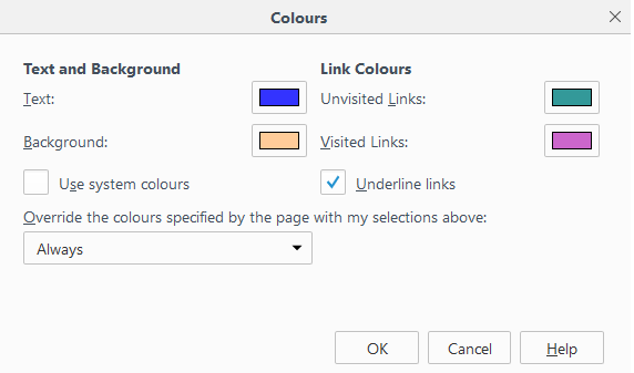
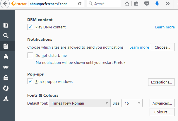
I use Firefox because it's the most customisable browser I've found. I 'break' websites' colour choices by telling Firefox to override the colours specified by the page and use my chosen colour scheme instead. To set up your custom colours, go to the Firefox menu > options > content and click the ‘colours’ button. Choose any colours you want - high or low contrast. Select ‘always’ in the ‘override the colours specified by the page’ box to apply your choices.
Beware of disappearing icons when you apply a custom colour scheme. As long as websites provide text alongside icons this shouldn’t be a problem. Google apps menu loses icons, but retains text for the different choices. The screenshot below shows how Google apps menu loses icons, but retains text for the different choices (my account, search, Google+, mail, calendar, drive, docs, sheets and slides).
You can also specify which font and size you’d like text to appear in using the Firefox menu > options > content. Select your preferred font and size preferences in the ‘fonts & colours’ section.
What barriers do you regularly face?
The most common problems I come across are .pdfs, website resolution, difficult to find menus, and fixed colour backgrounds.
.pdf files are a nightmare because you can’t customise anything. Not being able to enlarge fonts means you have to zoom in on the whole document and scroll around to read it. All that movement on screen is guaranteed to make me feel ill. With open document formats you can set background and text colours to suit, but that’s not possible in .pdfs.
Some websites don't work in my resolution. The site's page size can be wider than my screen with no option to scroll or tab across. That means I can only ever see half the page. I give up on those websites!
Menu options can seem hidden when they’re on the right hand side of the page or buried part of the way down. If I need to scroll around my screen to find links, I’m going to get bored or give up quickly.
Diagrams can be a problem. If they're on a fixed colour background (usually white) my colour scheme won't apply to them. If diagram text is high contrast or too small I can't read it.
What should content designers and developers be doing?
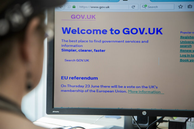
The most obvious thing for me is to use Responsive Web Design (RWD). This solves the problem of websites not fitting on my screen and I can access the same options as everyone else. Since RWD became mainstream around 2012/13 I've been able to use the mobile versions of most websites (including GOV.UK and the backend of GOV.UK). I'm a big fan!
Design accessible websites by:
- making your layout clear and simple
- having menus at the top of the page, on the left if possible, so that people using a low resolution find them quickly
- using .png files for diagrams because they're transparent; someone using their own colour scheme will see their colour preference as the background colour
- providing text alongside icons and images to explain what’s going on
- publishing HTML pages, not .pdf files, because they’re accessible to more users
- taking alternative text attributes off diagrams and putting them on the page; people who don't use screen readers but can’t read the text in your image won’t miss out (use "" in the alt text field because you'll no longer need any)
Making websites accessible needn’t be difficult. By building accessibility in from the start you can be more inclusive and reach a wider audience. A lot of people will appreciate your efforts - including me.
We'll be blogging more in this series so don't forget to sign up for email alerts.
4 comments
Comment by Nataly Anderson Marinovic posted on
This post is so useful for me to read with either my research or design hat on, as well as generally helping me being aware of what issues many people face in daily life.
I'll be sharing it with all my colleagues on our project team, everyone should know about this stuff.
Thanks so much!
Comment by Craig Cockburn posted on
Why are we still thinking exclusively about websites?
Government has services. People want or need to interact with them. Post is a channel. A phone is a channel. A website is a channel. These are not the only three channels that will ever exist.
Marian is partially sighted and at the moment is using a written medium (the written web) to interact with government.
In 2014, Google showed that over half of teenagers were using voice search daily.
In May 2016, the CEO of Google stated that 20% of mobile searches were by voice and Microsoft stated that quarter of all searches performed on the Windows 10 taskbar are Bing are voice searches.
Those numbers are only getting bigger and with more complex queries being understood as AI improves, voice interaction will increasingly become the norm.
The interaction style of many online services are often not much different to the old days of filling in paper forms except now we do it online. Whilst we may be some way off " Google pay my income tax" or "Siri renew my passport" or "Cortana file my self assessment" or "Alexa when is my NI due?" or even "Hey GDS log me in to gov.uk I can't remember my password again" but it's surprising that for people with certain disabilities which impair reading or writing and for those who just prefer voice (it's usually faster) that GDS isn't considering this as a valid interaction mechanism
User needs, not government needs.
Comment by Marian Foley posted on
Thanks for your comments, Craig. GDS is looking at voice navigation. However, this is my personal story so I concentrated on the main issues I'm facing.
Comment by Jack Penfold posted on
Hi Marian,
I listened to your presentation at the Accessibility meet up. I honestly think you're such a role model for many other people. It's definitely made me look at how stuff should be published, and the impact it does have to some people.