Colour contrast between text and background is important on web pages. It affects some people’s ability to perceive the information (in other words to be able to receive the information visually).
Everyone who can see, sees things in different ways. The human eye and brain is very good at distinguishing shapes, patterns and colours generally, but for a significant number of people (myself included) there can be difficulties distinguishing some shades, or some colours. The term colour blindness is used, but that may be misleading, and colour vision deficiency is better.
Around 1 in 12* men and 1 in 200* women have some degree of colour vision deficiency. Complete colour blindness (or monochromatic vision) is extremely rare. See NHS choices Colour vision deficiency page for more information.
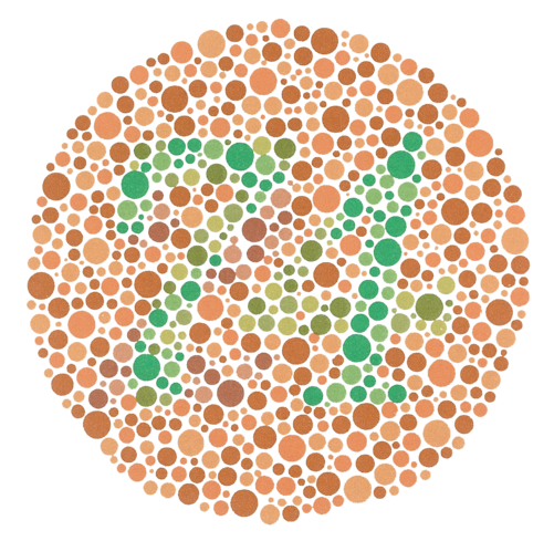
If you can see the number 74 in the main image above, you may have normal colour vision (but this is only one test), and if you can see 21 like me, you may have a red-green colour vision deficiency.
How colour contrast affects web design
There are two issues that need to be addressed:
- anything that is indicated by colour needs to have a secondary way for it to be distinguished - for example it is no good saying “use the green button if you agree or the red button if you don’t” by itself
- for text to be readable or other elements to be distinguishable they need to have sufficient contrast with the background.
This isn't just for people with a colour vision deficiency, it affects everyone in different ways:
- The amount of light that reaches the back of the eye reduces as a natural part of ageing
- Screens vary widely in size, resolution and contrast
- Reading in bright conditions is much harder because contrast is lower.
The Web Content Accessibility Guidelines (WCAG) recommend minimum levels for colour contrast between text and background, based on a mathematical formula.
There are tools that can be used to measure this and one that I use regularly is the free Paciello Group colour contrast analyser.
Examples of bad and good colour contrast
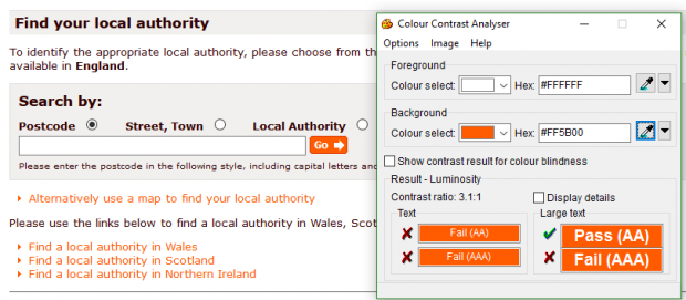
In the following example there are orange text links and an orange button with white text, that have low colour contrast (in this case a contrast ratio of 3.1:1 which is well below the recommended minimum of 4.5:1):
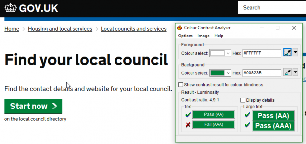
In the next example there is a green button with white text that has good colour contrast (with a contrast ratio of 4.9:1 which is above the recommended minimum of 4.5:1):
Things aren’t always what they seem
Don’t rely on just a visual check of colour contrast. It can help for finding obvious issues, or things that are obviously not a problem, but I know that I don’t see things in the same way as everyone, and even with good vision the mind can play tricks. My favourite optical illusion demonstrates this:
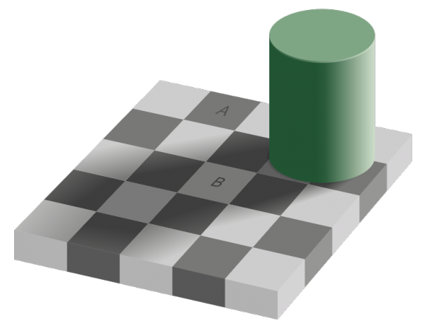
If you look carefully at the squares marked A and B they appear to be clearly different colours, or rather shades of grey, but if you check the colour with the colour contrast tool, you will find that both squares are exactly the same colour. The shadow cast by the cylinder tricks the eye and brain into getting this wrong.
Join the conversation on Twitter with Richard at @accessibleweb and GDSteam, and don't forget to sign up for email alerts.
*http://www.nhs.uk/conditions/Colour-vision-deficiency/Pages/Introduction.aspx colour vision deficiency.

8 comments
Comment by Craig Francis posted on
The last image is a very good demonstration (#787876 for both)... but could you make the letters the same colour (#505050 for A, #3E3E3E for B)?
That would keep the same colour contrast between text and its background, and the optical illusion still works 🙂
Comment by richardmorton posted on
It is possible that you could change the colours of the text and still get the same effect, but it isn't my image so I suspect they are deliberately slightly different. The original is at https://commons.wikimedia.org/wiki/File:Grey_square_optical_illusion.svg
Comment by Tahera posted on
I work for the VOA and they have updated their intranet but it would appear they have not reviewed the contrasting issues as some of the fields blend into the background for example the search box is difficutl to find. I tried to flag it up.
Comment by Calvin Smith posted on
GDS discriminates against a whole swathe of people that can only read things with contrast 6.0:1 or above - see the WCAG 2.0 AAA guidelines. How do you justify this?
Comment by Richard Morton posted on
We set a minimum level of accessibility at WCAG 2.0 AA, in line with industry practice globally (and roughly equivalent to the U.S requirements for section 508), but we do encourage going beyond level AA wherever possible. To meet the colour contrast guideline for level AAA it would need a contrast of at least 7.5:1 for standard sized text which our main body copy exceeds.
Comment by Sarah posted on
Hi Richard,
Is there a universal colour combination/contrast for background colour and text colour that is the most accessible? And if so, what is it and is there a reason why GDS do not use it for main body copy?
I am also wear this could just be black text with a white background 🙂
Thanks,
Comment by Richard Morton posted on
Hi Sarah,
There isn't a universal combination of colours for text and background that is accessible to everyone. The highest contrast is between pure black and pure white, so that would seem an obvious choice, but for many people with dyslexia that can be too extreme and so make the content less accessible. GDS uses a very dark grey instead of black for that reason.
Thanks, Richard
Comment by Bronwyn posted on
I agree that the minimum contrast level is too low. I struggle to see anything under 7 in many situations.