This blog by James Buller is the third in a series of blog posts about people with access needs. The aim of the series is to raise awareness of the different ways people access websites, the common issues faced and what designers and developers can do to remove the barriers.
Tell us about yourself
I'm a user researcher at Home Office Digital (HOD). I talk to and observe users of our services to understand their needs. I relay these to my team to improve our provision.
I'm also thrilled to be leading HOD on access needs alongside Emily Ball - raising peers and senior colleague's awareness, skills and standards of accessibility, plus sharing good practice across government.
Previously I was a Digital Media Manager at the Big Lottery Fund. Outside of work, I'm a trustee for Aniridia Network UK, the charity that supports people with my rare genetic eye condition. I manage all aspects of its communications, IT and membership.
Aniridia means my eyes didn't develop properly as a baby. Most obviously I have no irises – no coloured part of my eyes. That means I can't shut out sun or bright light. It also means I can't see detail and am very short sighted. Essentially I see everything over-exposed and in low resolution.
What visual aids do you use
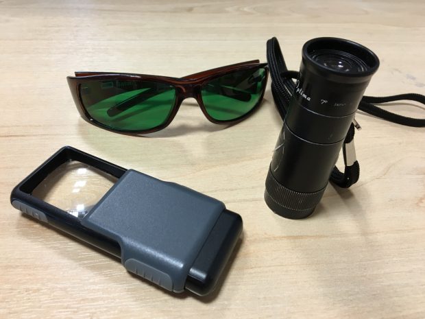
I use various magnifying glasses, including sometimes the camera and an app on my phone. To see things like presentations, I use a monocular. It’s a mini telescope capable of focusing very nearby. This is very useful when a colleague wants to show me something on their computer screen a few feet away.
When outside, rather than sunglasses, I wear special green tinted eye shields to cut out blue glary light, without affecting contrast too much.

How do you use the web (assistive technology)
Since my job is about usability of website interfaces, I avoid overriding their designs, such as with high contrast colours or larger fonts.
So I use screen magnification software set to at least 200%, often more .
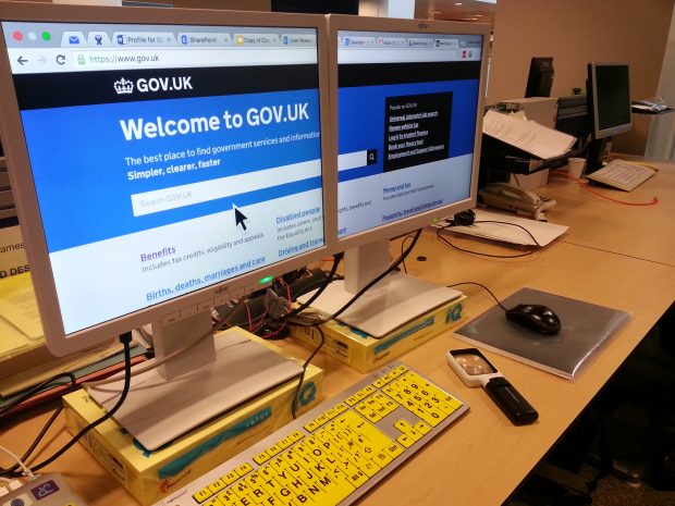
At my desk this view is spread across two monitors so that (most of) a line of text can be read with just head movement rather than horizontal scrolling.

That’s not possible with my Android phablet, but the large screen makes interfaces like the keyboards appear large. Plus even with large fonts or zoom, a decent amount of stuff is still in view.
I keep up with blogs using RSS (Really Simple Syndication) feeds and Google Reader app which has a text-to-speech feature. I listen to posts during my commute. The pronunciations can be fun. For example 'now read live reporting from GDS' could sound like 'now red liv reporting from geedesh' .
Similarly, on a computer I may use software to read out long passages of text or documents.
Podcasts and videos are great alternatives to articles. Particularly for tutorials, I'll seek out an audio-visual tutorial rather than a written guide.
It's hard to identify the right key to press on a regular keyboard even though I am a touch typist. I have high visibility keyboards (large black characters on yellow keys) to help. There's a nice silicone skin for my laptop. Many people who have used it make positive comments about its usability – showing how accessible adjustments often have wider benefits.
What barriers do you regularly face - on the web, interaction with government
Reading written materials or filling in paper forms is hard. Beyond the obvious, examples include: labels on sandwiches inside a glass counter; a reception desk sign in sheet; art gallery labels; or colleagues' post-it notes. As well as being hard to see, there are physical barriers or social expectations that inhibit my methods of perceiving them.
Then there are the problems of dealing with people and environments. Recognition is tricky even quite close by. I can't scan for people when walking into to a space. Hot-desking means I can't tell who's there or find the person I want. It's great when people do a big wave across a cafeteria or say 'hello James' to confirm that I'm in the right room!
Online, when using screen magnification the biggest difficulties are due to notifications, dialog boxes or buttons being out of my current zoomed field of view. I have to physically scroll around, hunting for the interface I need. That is disorientating, takes valuable time and lots of mouse movement effort (which could lead to repetitive strain injury).
Applications with text that cannot be enlarged are a pain. I can use the Android zoom but then have to swipe back and forth to read lines of text. To avoid that I've become good at reading the first three quarters of each line and guessing the rest, only swiping across when necessary. In many ways it is actually easier to use a physical 4x magnifying glass to read from and use a smartphone..
Similarly it is frustrating when content on web pages does not reflow when I increase the font size or reduce the window width. I do this to make articles display with big text but short line lengths so I can read more comfortably: with little horizontal head or screen movement. The same goes for most PDFs
I'll often give up reading rather than excessively scrolling my zoomed view back and forth.
Text that poorly contrasts with the background is also a big hindrance.
'Mega-menus' can be a nightmare. I'm constantly moving my mouse to the edge of the screen to move the area I'm zoomed into. I frequently open menus by accident as the cursor passes over the area that activates them. The menu then covers up the content I want to look at. I now have to scroll even further to clear the menu's area so it will close, then scroll back again. Frequently this re-opens the menu!
All that said, I far prefer electronic than paper in most situations.
I'd much rather write or fill in a well-designed online form with a keyboard and monitor, than paper and pen.
Likewise with things to read. I can make it as big as necessary or even audible. It may also be possible to do it on my preferred device, in my own time rather than under pressure when given the task So anyone who provides a digital option gets a thumbs up from me.
What should Content, Design, Developers be doing?
If you're a designer, developer or content expert you should try using your own site and unfamiliar sites with a screen magnifier to experience what your users encounter:
- if using Apple: System Preferences > Accessibility > Zoom
- if using Microsoft: Start > Control Panel > Ease of Access Centre > Start Screen Magnifier
Take time to get over the sea sickness like effects and then try to accomplish some tasks:
- see how hard it is to know what features are available and how to find the one you want
- experience the confusion when something unexpected happens but you don't know what or where
- discover what a difference reducing the width of a browser window make to the ability to read an article – when the text does and does not reflow
- try the a website with a hair-trigger flyout big navigation menus
Now you appreciate some of the frustrations, make sure your systems:
- place related interface element close together, particularly by minimising the need for horizontal or diagonal movement of a zoomed view
- use responsive web design
- have designs with good contrast - no grey text
- require a decent length of hover time to activate menus that open automatically
We'll be blogging more in this series so don't forget to sign up for email alerts.

