Karwai Pun is an interaction designer currently working on Service Optimisation to make existing and new services better for our users. Karwai is part of an accessibility group at Home Office Digital, leading on autism. Together with the team, she’s created these dos and don’ts posters as a way of approaching accessibility from a design perspective.
The posters
The dos and don’ts of designing for accessibility are general guidelines, best design practices for making services accessible in government. Currently, there are six different posters in the series that cater to users from these areas: low vision, D/deaf and hard of hearing, dyslexia, motor disabilities, users on the autistic spectrum and users of screen readers.
The dos, that run across various posters, include using things like good colour contrasts, legible font sizes and linear layouts. So, aren’t good design principles applicable to everyone and not just those with access needs?
While this is true, the aim of the posters is to raise awareness of various conditions through good design practice. We need to be mindful of not just designing or building for our own immediate needs. For example, consider designing for keyboard use only. This is particularly helpful for users with motor disabilities where using the mouse can be quite difficult, especially with precise movements, whereas keyboard use is much easier.
Another aim of the posters is that they're meant to be general guidance as opposed to being overly prescriptive. Using bright contrast was advised for some (such as those with low vision) although some users on the autistic spectrum would prefer differently. Where advice seems contradictory, it’s always worth testing your designs with users to find the right balance, making compromises that best suit the users’ needs.
The team
The content for the posters came from our accessibility team in Home Office Digital. Led by accessibility leads Emily Ball and James Buller, we are a group of twelve, each specialising on these conditions: blind and visual impairment, dyslexia, autism and ADHD, D/deaf and hard of hearing, mental health and motor disabilities. Collectively, we learn as much of the conditions as we can to better increase our knowledge so they can be shared within and outside the team.
One of the challenges we faced with the posters was gathering information from our different specialisms and reducing the vast amount of knowledge to ten principal dos and dont’s. There's also challenges surrounding content and graphics. I worked with Nick Cowan, a content designer, who is leading on motor disabilities, to keep the content concise and ensure the graphics visibly represented the advice accurately.
Next steps
We’ve shared these posters across government for feedback and they can be found on GitHub.
We are constantly improving and adding to them so please let us know what you think. Understanding accessibility through design means we can build better services for everyone, whatever their access need.
Update: We’ve been asked whether these posters can be reproduced or translated into other languages. In keeping with the the GDS ethos of making things open, we’ve used a Creative Commons license which allows everyone to share, use and build upon the posters provided they are used non-commercially and keep the appropriate attributions (Home Office, Home Office Digital and the Creative Commons logo). It would be great if people can share photos of them being used on Twitter and can commit translations of the posters to our GitHub repository so they’re available for everyone.
What the posters say
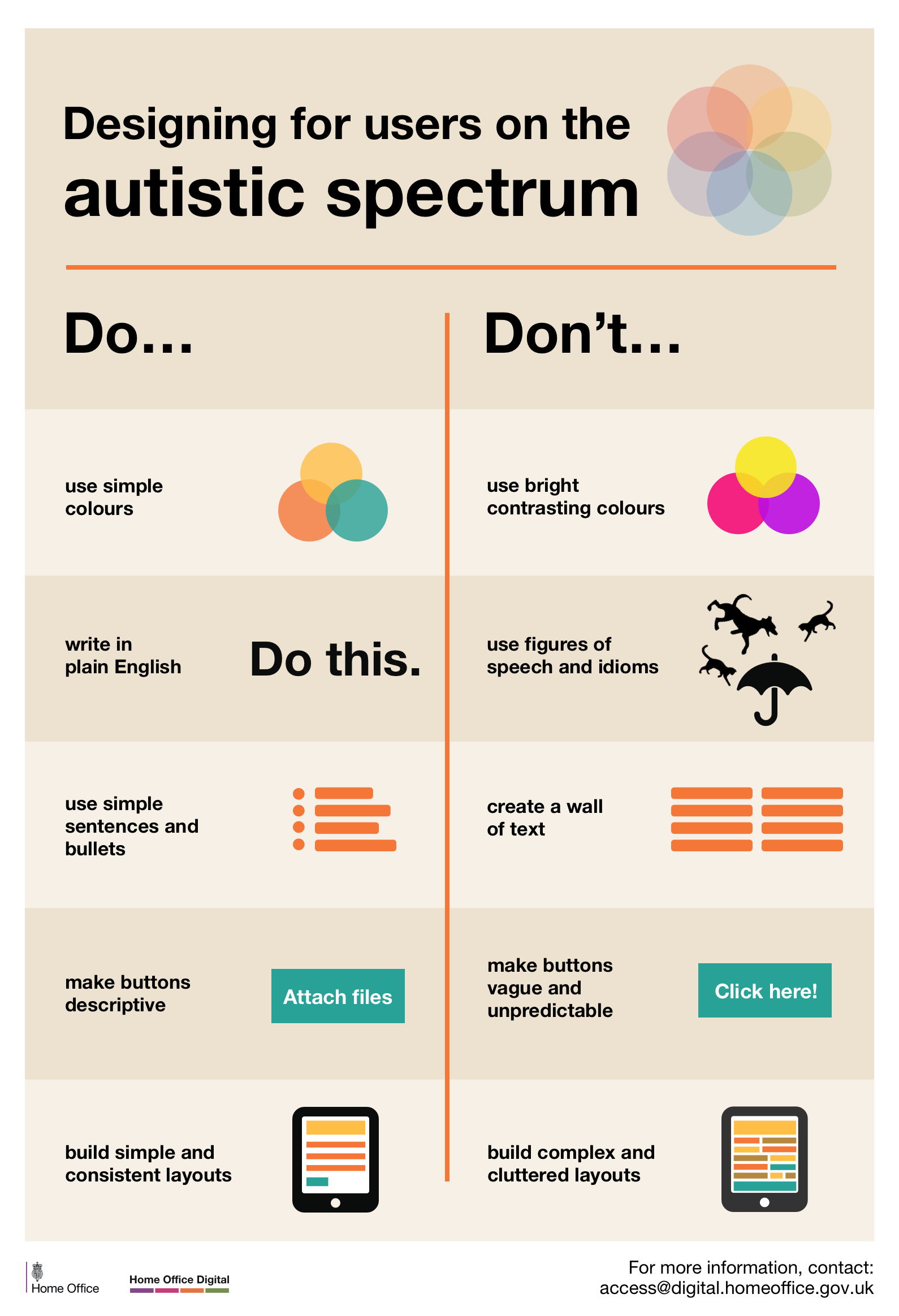
Designing for users on the autistic spectrum
Do
- use simple colours
- write in plain English
- use simple sentences and bullets
- make buttons descriptive - for example, Attach files
- build simple and consistent layouts
Don't
- use bright contrasting colours
- use figures of speech and idioms
- create a wall of text
- make buttons vague and unpredictable - for example, Click here
- build complex and cluttered layouts
View poster for the autistic spectrum
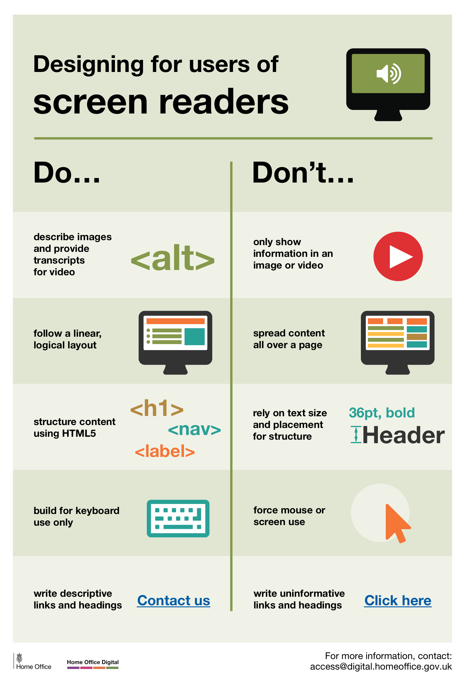
Designing for users of screen readers
Do
- describe images and provide transcripts for video
- follow a linear, logical layout
- structure content using HTML5
- build for keyboard use only
- write descriptive links and heading - for example, Contact us
Don't
- only show information in an image or video
- spread content all over a page
- rely on text size and placement for structure
- force mouse or screen use
- write uninformative links and heading - for example, Click here
View poster for screen readers
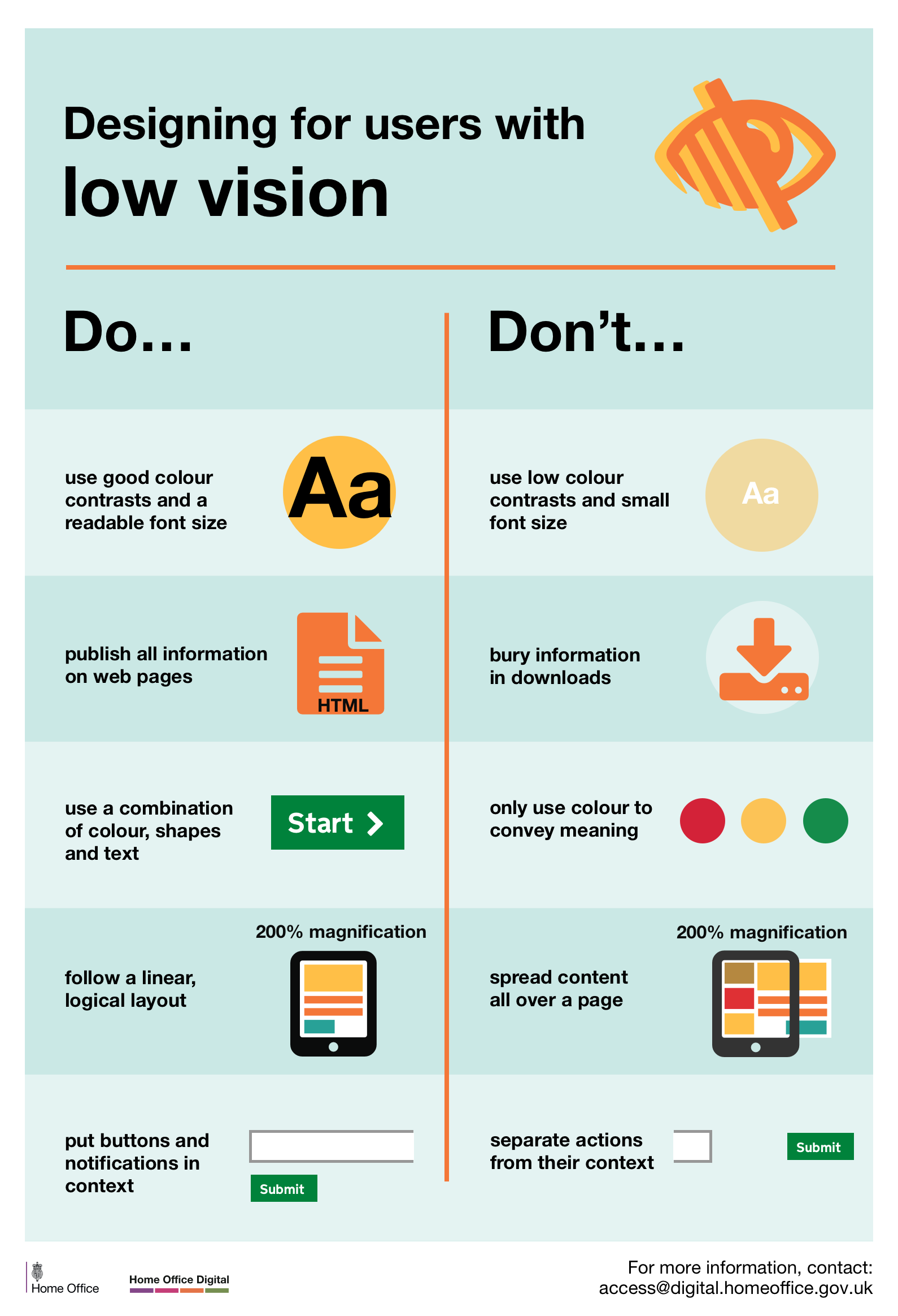
Designing for users with low vision
Do
- use good contrasts and a readable font size
- publish all information on web pages (HTML)
- use a combination of colour, shapes and text
- follow a linear, logical layout -and ensure text flows and is visible when text is magnified to 200%
- put buttons and notifications in context
Don't
- use low colour contrasts and small font size
- bury information in downloads
- only use colour to convey meaning
- spread content all over a page -and force user to scroll horizontally when text is magnified to 200%
- separate actions from their context
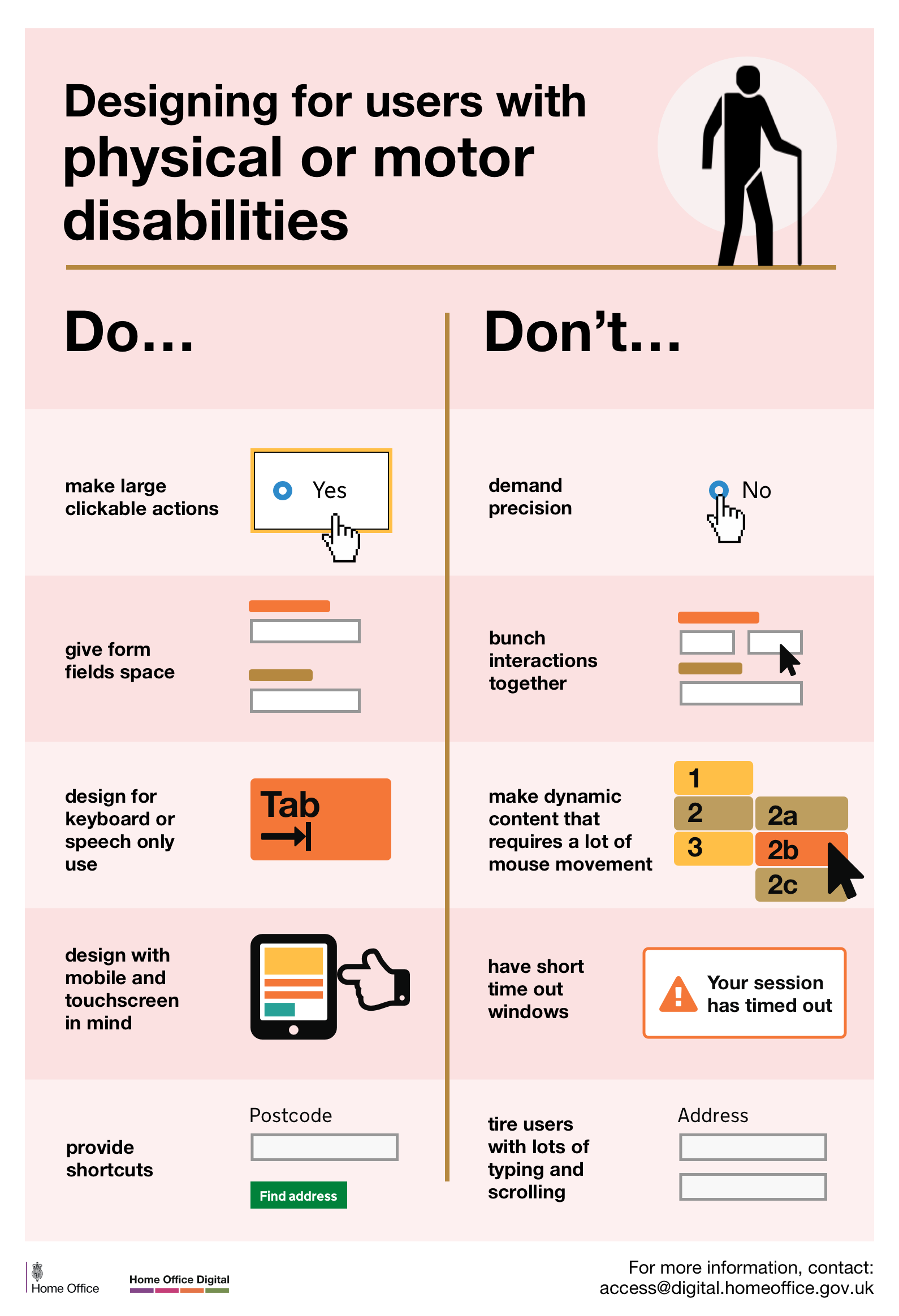
Designing for users with physical or motor disabilities
Do
- make large clickable actions
- give form fields space
- design for keyboard or speech only use
- design with mobile and touch screen in mind
- provide shortcuts
Don't
- demand precision
- bunch interactions together
- make dynamic content that requires a lot of mouse movement
- have short time out windows
- tire users with lots of typing and scrolling
View poster for physical or motor disabilities
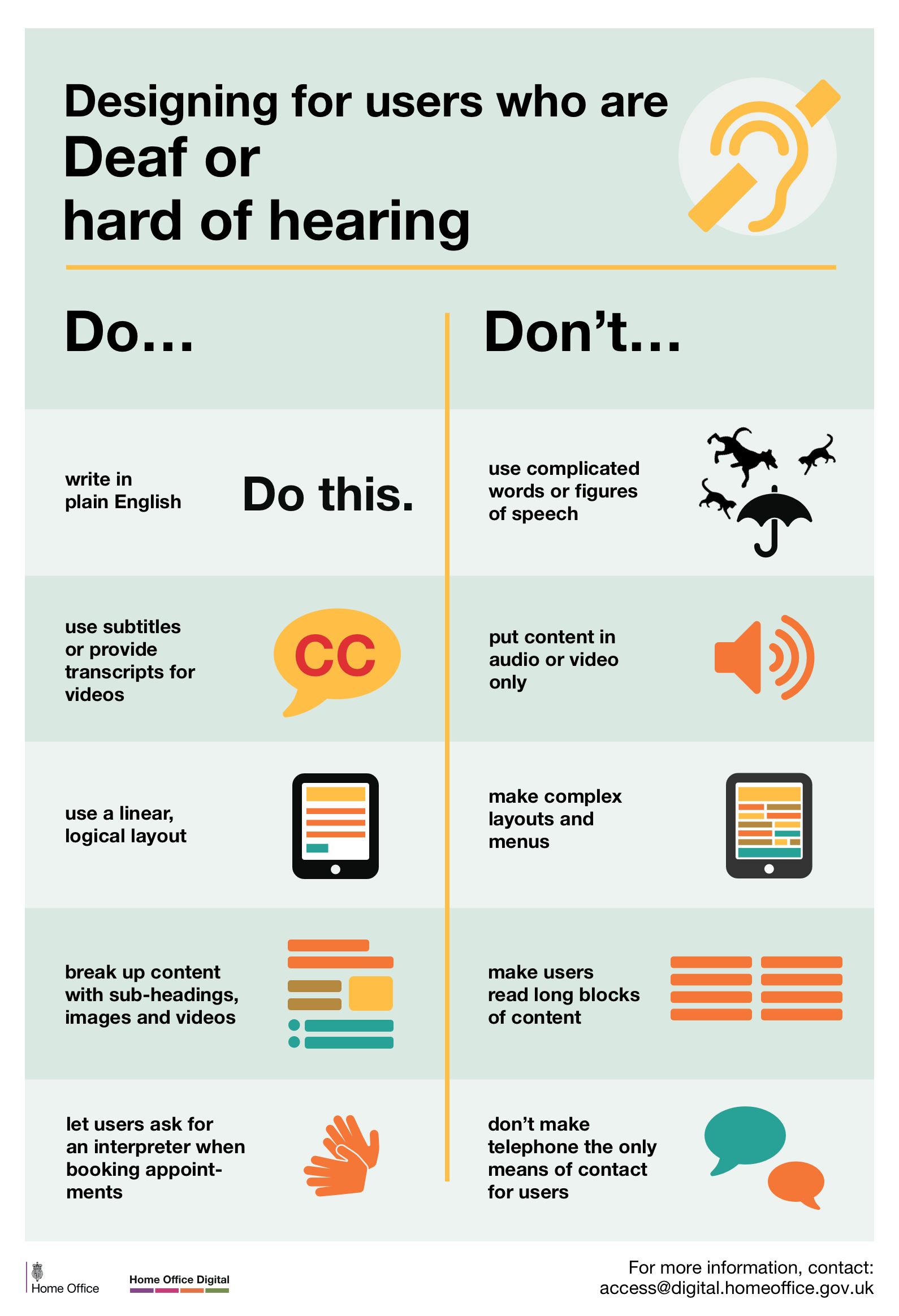
Designing for users who are D/deaf or hard of hearing
Do
- write in plain English
- use subtitles or provide transcripts for video
- use a linear, logical layout
- break up content with sub-headings, images and videos
- let users ask for their preferred communication support when booking appointments
Don't
- use complicated words or figures of speech
- put content in audio or video only
- make complex layouts and menus
- make users read long blocks of content
- don't make telephone the only means of contact for users
View poster for Deaf or hard of hearing
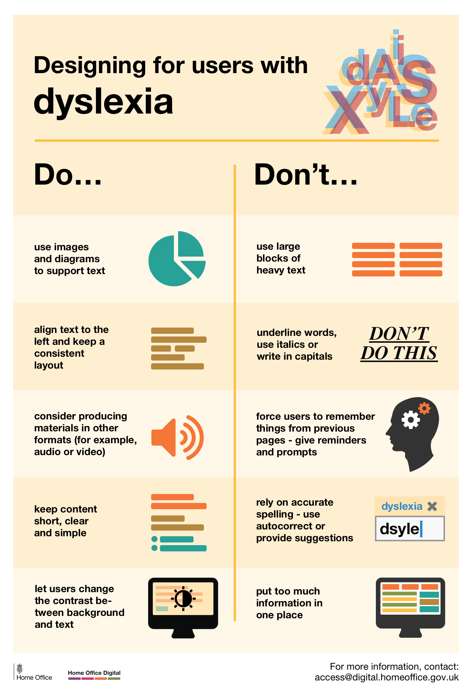
Designing for users with dyslexia
Do
- use images and diagrams to support text
- align text to the left and keep a consistent layout
- consider producing materials in other formats (for example, audio and video)
- keep content short, clear and simple
- let users change the contrast between background and text
Don't
- use large blocks of heavy text
- underline words, use italics or write capitals
- force users to remember things from previous pages - give reminders and prompts
- rely on accurate spelling - use autocorrect or provide suggestions
- put too much information in one place
Follow Karwai on Twitter and don't forget to sign up to email alerts.

99 comments
Comment by Darren posted on
Downloaded, printed, and displayed in Dept for International Trade! I loved these when I worked in 2MS and I'm glad you've shared them.
Comment by Karwai Pun posted on
Thanks Darren. Glad you liked them.
Comment by mukul posted on
nice post.
Comment by bernard posted on
Hi Darren,
We'd love if you could take a photo or two to show us them hanging. You can send them to us on Twitter - @hodigital, @krwpn, or @bernardtyers
Comment by Simon Hurst posted on
Brilliant work, great job.
Comment by Karwai Pun posted on
Thanks Simon. We'll be adding more to the series.
Comment by Mark Lomas posted on
Great posters and tips!
Comment by Karwai Pun posted on
Glad you like them. It's been a hugely collaborative effort with our team here at Home Office Digital.
Comment by Tom Norman posted on
Excellent work Karwai!
Comment by Karwai Pun posted on
Thank you Tom.
Comment by Joy Hooper posted on
These posters look excellent - most timely. I have already shared these with some of my colleagues.
Comment by Karwai Pun posted on
Thanks Joy.
Comment by Michael posted on
I like the idea here but a couple of things:
1) GitHub is terrible on mobile so you can't read or view these properly (in fact it's terrible everywhere)
2) left justified for dyslexics is a myth. I'm dyslexic and text needs to be justified or I'm lost at the end of every line. It's specific learning difficulties, far better to make it appealing and something I want to read
3) don't make long scrolling pages - they are really difficult to understand
4) someone needs to sort out the forms here... The auto focus is confusing
Comment by Karwai Pun posted on
Hi Michael, appreciate your points. Apologise if this wasn’t made clear but we present these posters for general guidance; however, it is worth testing these design principles with users to ensure we get the right balance and make compromises where necessary as what may work for some may not work for others.
Comment by Michael posted on
No worries. If you can move the images off GitHub it would be much easier to see the content.
Also, from my perspective it's worth speaking to the folks at TFL for good accessible mobile websites - GOV.UK has become text heavy and really difficult to navigate.
Comment by Karwai Pun posted on
Hi Michael, we've provided additional links to view each poster now towards the end of the blog post. Hope that helps.
Comment by Brian Donahower, MSEd. posted on
As Michael indicates, there is a difference between meeting regulatory accessibility guidelines (US: Section 508 refresh & WCAG 2.0) and meeting the needs of disabled [adult] learners. Simple example pointed out to me by a screen reader user... at the end of a text-only accessible document (typically HTML5). add an H2 Header that indicates End of Document. His best advice though: Download a trial version of JAWS, arrow through the content page by page, and listen to your content before you publish.
Comment by Max posted on
Very useful, thanks. Small thing, I think there's a typo in the "What the posters say" section.
"let uses as for an interpreter when booking appointments"
Comment by Karwai Pun posted on
Thanks Max, it's been updated now
Comment by Luca Ruffini posted on
Great job Karwai!
Comment by Karwai Pun posted on
Thank you Luca.
Comment by David Boden posted on
As a blind person, I am really pleased that all this is being publicised. However, it should have been proofread and typos removed before making it public. "make button vague" should be "make buttons vague"; "image of video" should be "image or video"; "use a liner" should be "use a linear,; "layouts and and menus" should be "layouts and menus". Keep up the good work though.
Comment by Karwai Pun posted on
Hi David,
We've made the corrections, thanks for letting us know.
Comment by David Wilton posted on
great post and resources
Will these posters be available in Welsh?
We can't use them, put them up or promote unless we have in both languages as per Welsh language legislation.
Comment by Karwai Pun posted on
Hi David,
In the GitHub link, we've provided a Sketch workfile that you can download and use so the posters could be translated into different languages. Hope that helps.
Comment by bernard posted on
Hi David,
We've gotten lots of requests about translating them to other languages.
Here's a discussion on Github where someone wants to translate them to French: https://github.com/UKHomeOffice/posters/issues/4
We'd really appreciate (if you can) to commit the translations to our repository so they're available there for everyone.
Comment by NS posted on
Says it all that the *UK* Home Office doesn't create Welsh versions by default. Responding that "we've made it easy for you do your own translations" isn't an acceptable response from *our* own government
Comment by Karwai posted on
This project started as a set of internal-facing posters and we're iterating as they develop. The posters are open for translation here: https://github.com/UKHomeOffice/posters/tree/master/accessibility"
Comment by Kerry Lambeth posted on
Hi Karwai,
These look great and so useful - thank you for creating them! Would there be a problem with using them on HS2 Ltd's internal communications pages? We're doing a visibility push around accessibility in comms in December, and these would be a great resource to share.
Comment by Karwai Pun posted on
Hi Kerry,
Yes, please feel free to use them. We want these to be shared as much as possible.
Comment by bernard posted on
Kerry,
It'd be great to see some photos of the posters, in action!
It'd be great if you could tweet some to us: @hodigital, @krwpn, or @bernardtyers
Comment by Nicky Reeves posted on
tthese are great, many thanks. Can I encourage you to develop one that specifically considers people who navigate their computer with voice recognition software,, as I do?
Comment by jamesbuller posted on
Great idea Nicky. Do you have any particular recommendations that you would want included?
Comment by jimmy posted on
nice
Comment by JonghoKim posted on
I want to deploy the language of various countries.
As an example of, Korean
Comment by Karwai Pun posted on
We have a Sketch workfile on GitHub that can be used to reversion the posters into different languages.
Comment by Chob posted on
Is there any possibility to get another source file to translate them? Accessibility should expand to non-Mac users 😉
Comment by Karwai Pun posted on
We're currently looking to create them in another source file for all users. We'll let you know once that's done. Appreciate your interest in these!
Comment by bernard posted on
Hi JonghoKim,
We've gotten lots of requests about translating them to other languages.
Here's a discussion on Github where someone wants to translate them to French: https://github.com/UKHomeOffice/posters/issues/4
We'd really appreciate (if you can) to commit the translations to our repository so they're available there for everyone.
Comment by Alexis posted on
I'd love to see the research your team has done that led to these wonderful posters. Specifically, the work done to optimize for hard of hearing users. Are there links to studies? Thanks!
Comment by Karwai Pun posted on
Hi Alexis, regarding our D/deaf and hard of hearing poster, this article was quite useful in feeding into our designs: http://alistapart.com/article/deafnessandtheuserexperience
Comment by Inca posted on
Great simple overview!
I'd like to add a do/don't to many, concerning animation, sliders and moving text: provide a way to pause them and navigate them manually.
This is important to limit distractions, and to accomodate those who cannot take in the information of the animation / slider / moving text at the pace it dictates. This may be true for low vision users, users on the autistic spectrum, users with dyslexia and users with motor disabilities, and also users with cognitive impairments.
Comment by Karwai Pun posted on
Appreciate the feedback Inca. We can feed this into future iterations of our posters.
Comment by Ollie Nilsen posted on
Great work, Karwai
Comment by Karwai Pun posted on
Thanks Ollie.
Comment by Bart Nelis posted on
Very nice infographic... I really like the fact that it is not just about 'blind people' but all sorts of users
Comment by Karwai Pun posted on
Glad you like them, thanks Bart.
Comment by David posted on
Speaking of accessibility, a download link for the posters would be awesome 😀
Comment by Karwai Pun posted on
Hello, there's a download link on GitHub: https://github.com/UKHomeOffice/posters/tree/master/accessibility
Comment by glen posted on
Nice posters. They'd be even nicer if you went one more step and made the PDF files accessible (ie, tagged pdf). Visually, they look like tables so you could tag them as tables. Or you could tag them as bulleted lists like you did in this article.
Comment by glen posted on
I should have started off by saying 'thank you' for working on accessibility rather than going right into my suggestion. Quite rude, sorry.
Comment by Karwai Pun posted on
No worries Glen. We've received quite a lot of attention on these posters and are aiming to make them as accessible as we can . Tagging the PDFs will be the next thing we look to improve. Many thanks.
Comment by Mustafa Zahid Efe posted on
They're really important advices. I gonna translate those to Turkish. I hope it won't be problem 🙂
Comment by bernard posted on
Hi Mustafa,
Please do translate them -
Here's a discussion on Github where someone wants to translate them to French: https://github.com/UKHomeOffice/posters/issues/4
We'd really appreciate (if you can) to commit the translations to our repository so they're available there for everyone.
Comment by Jules posted on
As someone with mild aspergers - and an aspergers son - and a School Governor with interest in the Autistic Spectrum may I comment on the Accessibility Poster :
i) "Simple colours".
This may SEEM to chime with "write in plain English" - but it doesn't actually help.
Autistic spectrum people tend to take things literally. Euphemisms (or over-simplified icons) can be not understood.
So things need to be familiar - not in code (hence plain English) - but this also means that realism (or skeumorphism) is better than unrealistic "flat" - so shading and depth are preferable to bright "Fisher Price" colours.
ii) "Don't ...." use flat monotone icons - absolutely, so why are there so many around?
iii) Use bullets not text blocks. Absolutely - so why so few lists of Contents ? These help provide context and info in a quick to read, user-friendly fashion.
iv) Buttons SHOULD be descriptive - so what is wrong with "click here". It tells the User exactly what to do.
Doubt arises if the text alongside is unclear - or the "button" doesn't look like a "button" but a plain slab with plain text instead - like "Attach files".
v) "Yes" to simple layouts rather than the jumble shown to the right - but distinct panels and columns for Contents, themes or functions all in one view are preferable to a single column that has to be scrolled. Why ? Because context is best assimilated all together rather than relying on memory as content/navigation scrolls out of view.
Comment by Karwai Pun posted on
Hi Jules, many thanks for your feedback. Regarding your point on buttons, while "click here" do literally tell the user what to do, what we were aiming for was to explain that the words were unclear as to indicate what will happen next once that button is clicked. However, your other suggestions, including the one on skeumorphism and coordinating layouts so memory is not heavily relied upon is duly noted. You've raised some interesting points to consider which can feed into improving and iterating these posters further which is greatly appreciated so many thanks for that.
Comment by Nathan McIntosh posted on
Hey Jules,
When screen readers are used some users navigate quickly using only the links on the page as navigation "waypoints" to jump to the section they want.
If there are 5 "Click here's" on the page (and typically no <alt> text) it can be hard to know which one is the right "Click here".
Then you expect the user to listen to a full url to figure out what the destination of that link will be.
We found this out by seeing exactly how some blind users navigate pages using a screen reader.
Hope that helps. 🙂
Comment by Jon Kantner posted on
Very helpful stuff! By the way, I have one question. Would “hiding in the shadows” be considered a figure of speech? I want to use it in a blog post, but I’m not sure if it would confuse those with autism or other brain disorder.
Comment by Karwai Pun posted on
"Hiding in the shadows" can be interpreted literally but it does depend on an individual basis. Someone with high-functioning autism may have a hard time understanding idioms although it won't necessarily affect their basic language skills.
Comment by Jake posted on
Thanks for this great post. I saw a link to it in this week's issue of "Top Tech Tidbits for Thursday." I think you've covered some good tips for screen reader access. Inaccessible CAPTCHA's are a big "no-no" in my books. I am not a fan of audio CAPTCHAs either because people who are deaf/hard-of-hearing cannot use them. I personally have gotten some of the audio ones to work, but if at all possible they should be avoided.
Comment by Karwai Pun posted on
We're gathering a lot of useful tips and advice from feedback we've received to feed into future iterations of the posters so really appreciate your feedback. Thanks Jake.
Comment by Vi-Naita Begonia posted on
Can I translate them into Chinese and forward?
Comment by Karwai Pun posted on
Yes. If you can commit the translations to our repository so they're available for everyone.
There's a discussion on Github where someone wanted to translate them to French: https://github.com/UKHomeOffice/posters/issues/4
Comment by Steve Blakeborough posted on
This is an excellent resource. Thank you so much for sharing. I'll definitely be printing them out and putting them up in the office.
Comment by Lynn Fisher posted on
Thank you very much for these posters. The City of Philadelphia Office of Emergency Management will keep these helpful tips in mind while designing our outreach materials.
Comment by Lloyd posted on
Great series - have them on my wall at work!
Would love to have seen "don't upload images of text" for the screen readers poster though. It's something I come across at work a lot, and it's a big no-no for users with disabilities.
Comment by Karwai Pun posted on
Hi Lloyd, we're keeping a list of suggestions and tips from everyone for future iteration and next steps with the posters so we really appreciate your feedback. Thank you.
Comment by Research Snipers posted on
This is a really great post. I was expecting a dry list of boring do’s and don’ts. But the way you put it together is pretty good. Thanks!
Comment by conseguir dinero online posted on
A great list, I really congratulate you for all the work done, without a doubt the one who made this publication deserves 5 points
Comment by Claire Murray posted on
These are great resources and i've linked to them from our website http://www.pifonline.org.uk
We (the Patient Information Forum) are putting together an event on accessible health information, we'd love to have someone from your team come and talk about your work developing these guidelines and designing accessible digital information.
You can contact us at claire.murray@pifonline.org.uk if you'd be interested to find out more about our work and the event.
Comment by Karwai Pun posted on
Hi Claire, thank you, glad you found the posters really helpful. We'll get in touch with you soon to discuss your event in more detail.
Comment by Ayietim posted on
Great Post.
Comment by Gustavo Woltmann posted on
This information is very timely, I will comment it to some friends who are engaged in this, thanks for this incredible post
Comment by Cheryl Joyce posted on
This work is really refreshing and highlights the specific needs of the different users quite accurately.
Just a thought, although there are some common issues within the different user groups, people are individuals, so I think the ability to personalise is what will truly enable accessibility.
I am the mother of an autistic child and a policy/procurement professional for CCS. I'm personally grateful for these efforts and would like to know how to get involved?
I do have a question, from the designer's pov:
These needs are wide ranging and sometimes contradictory across the different types of users. How can a designer meet all these needs for one website?
Is there a way to design all the elements for each of the different users and then put them on some sort of overlay? And when say, an autistic person uses the site, they can turn on the design that's meant for them, or a person who is blind can turn on the design suited for them etc..
Or should a designer include as many elements as possible to suit as many different users as possible, and then allow ways for the user to personalise the site to their needs?
Hope this is helpful, thanks
Comment by Karwai Pun posted on
Hi Cheryl,
Thank you for your comments. Regarding your question about how to design to meet all needs, the baseline would be to design in such a way that you’re incorporating as many of the best design practices as possible so that anyone regardless of ability or condition can use your site; from there, you can further personalise the site according to specific needs like customising personal settings or downloading plug-ins and certain software tools which can help.
With the posters, we’re currently looking at ways of improving them based on the feedback we’ve received by starting to code them as a site so they can be more responsive and accessible. Some of the approaches we’re looking at is perhaps showing all of the best design practice with the ability to choose those design principles that impact certain users more than others. We’re still thinking about this so your comments on personalisation based on needs has been timely and welcomed.
If you’d like to get involved, we’ll let you know soon where you can give feedback and suggestions on our new poster project. Thank you.
Comment by Matsuko posted on
I'd be interested in helping out with creating a web version of these posters. Let me know if you need any help!
Comment by Karwai Pun posted on
Thanks Matsuko. The work our interns Megan and Simon are doing is currently being developed here: https://github.com/megandrodger/access-poster . Feel free to drop them a note to say hello 🙂
Comment by Georgina posted on
Really useful resource, thanks. I plan on printing them out on putting them round the office to make people keep thinking about them.
Comment by Roberto posted on
Excelente trabalho.
Comment by Sascha Leib posted on
Hm, to me this looks a bit like the same set of best practices that should be followed - not for people with specific needs but for all users - has been inflated to cover 6 different "specific needs" groups.
This makes it look again as if accessibility is something we do for handicapped people. It isn't. It's something we do for everybody.
True, some people profit more from these best practices (like, deaf people from an audio transcript) - but is it hard to understand that I, as a non-deaf person, also prefer to read a transcript to listening to the audio file (not to mention that I can use search on it). And the same is true for almost all aspects of accessibility (I also don't enjoy reading if the colour contrast is wrong, etc.)
And for this reason, I would recommend that we start with a poster that says "For all users:" with the basic best practices (which include, e.g. "write in plain English", "don't use ALL CAPS", etc.).
If then there are some aspects left that are only relevant for specific target groups - very well, add a note. But the main theme should be: Accessibility is for everybody!
/s.
Comment by Karwai Pun posted on
Hi Sascha, thanks for your email. I appreciate and fully agree with your comment that accessibility is for everybody. The posters are indeed good design principles for everyone and are not exclusively for the user groups in the posters. The reason behind creating the posters is to raise the profile of different users in our community and increase awareness of different conditions that people have. We do so by highlighting what good (and bad) design looks like, especially focusing on ones which affect some more than others.
So we could create a poster for all users but feel we'd lose the purpose of being able to learn and understand more about the different users that make up our diverse society and in the process, we get to appreciate how good inclusive design makes for good design for everyone.
Comment by Juan Olvera posted on
This is amazing. Thanks a lot for putting this together.
Comment by iulia posted on
Hi, there, everyone!
Grateful for your great jobs and consideration! 🙂
I would like to contribute by translating the texts in the posters to Romanian... but don't know to do the design of the posters...
Let me know if this is of help... 🙂
Comment by Karwai posted on
Hi Iulia,
We'd love to have a Romanian version of the posters. Information on how you can translate them are here: https://github.com/UKHomeOffice/posters/blob/master/accessibility/LOCALISATION.md
Any questions, do let us know and we'll be happy to help.
Comment by kraftivo posted on
great going..
Comment by Kanokkan Kaewkong posted on
????????????
Comment by Pat Reynolds posted on
I know what you are trying to say with "Don't spread content all over a page -and force user to scroll horizontally when text is magnified to 200%" and that it comes from the AAA standard, but it doesn't really cover modern websites, which are often responsive (so horizontal scrolling isn't a thing even if zoomed to 500%). Far more important is "Don't spread content apart down a page with blocks of space - forcing a user to scroll vertically when text is magnified at 110%" (which is all I usually need, despite vision loss, as I have a VERY large display screen that takes it to the equivalent of 175% on my laptop screen). I dread the HMRC website being brought into gov.uk standards, for example, as you put too much space between questions and navigation, forcing me to scroll down to 'next' or 'back' ....
Comment by Craig Weston posted on
Great article
Comment by Jayne Cravens posted on
I love this effort for so many reasons. I'm not a web designer, but I often manage web designers, and I need to make the case for accessibility to them. These posters will help me do that! I also work for Knowbility, a nonprofit organization that promotes accessible design for online tools. They have a hackathon every year called OpenAIR (http://www.air-rallies.org), where design teams build websites for nonprofit organizations, and work to make the websites accessible using the standards you promote in your posters. These posters will help me better explain to the nonprofits what the web designers will be doing. As of the moment I'm making this comment, there are still openings for web design teams - would love to have a team (or more!) from the UK participating in this hackathon (it's entirely online!). And, finally, these posters are going to help me in my international work - I have struggled to explain accessibility when I'm working overseas to people for whom English is not their first language. These posters are really going to help me!
Comment by Gerard posted on
Very useful post, but the example for providing shortcuts seems like a poor one. In cities with tall apartment developments the number of addresses in a postcode can be so long as to make ONLY asking for a postcode significantly more tiresome in terms of "typing and scrolling" (emphasis on the latter), than (for instance) asking for number AND postcode.
Comment by Ben posted on
These are fantastic!
Do you have (or know of) anything like this for Website Security ?
Comment by Klaas Posselt posted on
Hello,
I am glad to find such posters.
At the moment i am writing a (german) book about accessible PDF, and it would fit perfect, to have the posters inside.
As this book is published by a publisher (dpunkt), it would violate the CC rules. But i defiantly not writing this book for money and would be happy to convince more people to publish accessible with your posters! Is this possible? You can contact me via Twitter: @einmanncombo
Thanks, Klaas
Comment by Karwai posted on
Hi Klaas,
Thank you for your comment. We consulted our team and it should be fine to include the posters in the book. Please let us know when the book is out, we'd like to see it as well. We appreciate all the great responses so far.
Comment by Klaas Posselt posted on
Thanks a lot!
The books is already listet on the publisher site, but its not finished. I hope it will be released this summer. https://www.dpunkt.de/buecher/12679/9783864904875-barrierefreie-pdf-dokumente-erstellen.html
Comment by Jed Exodus posted on
Some guidance on considerations for colour-blind users would be good. 1 in 10 men are colour blind.
Comment by Karwai posted on
We've stopped creating any further posters but do feel free to use our template to build one for colour blindness. We're really keen to see what others have done and it would be great to share.
https://github.com/UKHomeOffice/posters/tree/master/accessibility/dos-donts/posters_en-UK
Comment by Ann posted on
I find the upper right icon for Dyslexia offensive. I don't see blurry or out of focus letters. I tend to see them flipped and have to pause and think -- like b and p or d and q. There are probably others who have different challenges.
Comment by Beatrice Sephton posted on
As a Disability equipment dealer, i would say its really useful resource. Is it okay to hang this as a poster in our office?
With Regards,
Beatrice Sephton
Aids4mobility
Lees Lane Nursery, Lees Lane, Dalton, Parbold, Wigan WN8 7RB, United Kingdom
Comment by Karwai posted on
Yes, you can print and hang these posters in your office. Feel free to share pictures of them on your walls and tweet about them. We'd love to see them.