In my role as Head of Accessibility for DWP Digital, I’m responsible for trying to make sure that all of our services can be used by as many people as possible. For DWP, accessibility is particularly important as we have a higher proportion of users with disabilities than other government departments, due to the nature of the services we provide.
That’s not to say that it’s only an issue for us though. At its simplest, accessibility is about making sure things work for everyone. A lot of the time people see accessibility as a technical problem, but we need to remember that at the heart of it is people and their needs.
Making something accessible is just making sure that we don’t leave anyone out, just because they might happen to use the internet in a different way.
Accessibility should not be an afterthought
In DWP I’ve been trying to address the way in which we look at accessibility. Historically, services have been built and accessibility is shoehorned in at the end. We need to find a way to bring it into the process from the start, and to make it part of our definition of done. We need to make sure that before we release anything to the public, it’s been tested and we can be sure that it works for everybody.
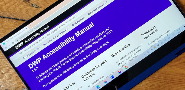
One of the ways I’m looking to make progress with this is with the DWP Digital Accessibility Manual. The hope is that this will act as a live resource for people who need to consider accessibility as part of their role. It’s a place to find a lot of content in one place, where people can go and see how the laws such as the Public Sector Bodies Accessibility Regulations impact them and their work.
The manual was built on user needs off the back of some user research that our department did. With the help of my colleague Emma Nicol, a user researcher in DWP Digital, we spoke to over 200 people from our department in order to get an understanding of how accessibility could be improved.
What we found was that the knowledge on accessibility could be a bit inconsistent. People didn’t have a go-to place to absorb good working practices and knowledge on the subject. So we decided to create it.
Creating the manual
The manual is built and maintained on spare-time and passion. We don’t have a dedicated team; it is just a handful of people wanting to make things better.
We started by reusing a lot of the great work done by GDS, using a modified version of the GOV.UK Design System and GOV.UK Frontend. By reusing an already well-designed and well-researched template, we were able to deliver something which works for people in just a couple of months.
For the manual, a lot of the content was written by myself as a first iteration just to get it out there. The plan has always been to iterate it and make it better over time, and people have already been adding to the content based on their own expertise. Big thanks to my colleagues Colin Oakley, Catherine Hope and Chris Thompson for their contributions.
In terms of content, the manual has an overview on the different laws and standards that impact accessibility, plus guidance for the most common job roles that deal with accessibility day-to-day, such as content designers, software engineers, frontend developers and user researchers. There’s also a section on best practice which is provided as a guideline for people to align with their own processes, plus links to some of the best tools and resources available elsewhere online.
Although it’s designed with our department in mind, it’s also useful across government and in the private sector. There is some stuff on accessibility in the GOV.UK Service Manual, but nothing that really covers a lot of detail all in one place. So hopefully this will help so that you don’t have to trawl the internet looking for different bits of information.
A community led ambition
The ambition is that the Accessibility Manual will be an open, community-led document that anyone can contribute to - it’s important that we're collaborative and inclusive. Making it open access means that we’re unlikely to end up in a situation where lots of people are writing slightly different versions of the same thing because we missed something out that they felt was important.
It also helps with getting the widest knowledge base possible. Nobody can know everything that’s upcoming, and technology is always changing. A community-led effort means that you've got a lot more avenues for input, rather than relying on just your own knowledge.
Accessibility involves everyone
A great example of that community-led direction was when I recently tweeted about the manual and asked people to let me know their thoughts. We got some great feedback on the early draft such as the possibility of including a section about modelling disabilities which we’re now looking to include.
Alternatively, owning it as a central body and having all of the control over it means that instead of getting this important feedback, we’d actually be limiting how good the resource can be.
From the research we conducted it appeared that some roles think that accessibility doesn’t affect them. There’s a misconception that it is the responsibility of a designer or developer, when actually it’s the whole team.
If a business analyst is writing user stories, then they need to have in that acceptance criteria that it needs to be accessible. Inversely, if you're a delivery manager, then you need to consider when accessibility should be factored into the delivery timeline right from the start.
Thinking that it's just a developer's problem or just a designer's problem is quite short sighted. And putting all of the onus onto those roles will likely mean you will end up with something that's inaccessible at the end.
That’s where we hope the Accessibility Manual can be a useful tool for anyone - if you’re not sure, you can use it as a reference point.
Other accessibility resources
We’re not claiming that the manual is the complete answer to accessibility questions, though. There’s plenty of other resources which are useful, I’d always start with the WCAG Guidelines as they’re the rules we’re working to.
It’s also important to start with things we know are accessible. GOV.UK Frontend and the GOV.UK Design System offer a foundation which is already accessible, and they make it a lot easier to test as you’re not having to create everything from scratch.
Even outside of designing and building services we need to consider accessibility. The way we structure documents, colours we use, the links we post and the use of images can all contribute to how accessible something can be. A great resource I’ve used on many occasions is the SCULPT framework created by Worcestershire County Council.
You can use SCULPT if you’re making a Word document for example, to make sure it’s got the correct structure, the correct headings, all that kind of thing.
Another great resource to consider if you’re designing anything, is the Home Office Accessibility Posters. They cover best practices and common mistakes you can make, covering a wide range of different impairments, so you don’t accidentally design something which causes issues for people.
I hope that the Accessibility Manual will sit alongside existing resources like this in order to help anyone looking to make their services more accessible.
Get involved
If you want to contribute to the manual or reuse any of it for your own projects, then you can. The whole thing is open source. You can find the DWP Accessibility Manual on GitHub and help us to improve content or fix bugs. We will always welcome feedback and improvements.
I also recently spoke in more detail about the Accessibility Manual on the DWP Digital podcast. It’s available to listen to now on Apple podcasts, Spotify, Google Podcasts or wherever else you might listen.


2 comments
Comment by Simon Hurst posted on
Brilliant, thanks for this Craig and colleagues, this is going to give our fledgling community at the Department for Education a huge leg up.
Comment by Swéta Rana posted on
This is fantastic and I can't wait to delve in - thank you!