
Last week I returned from a bucket list holiday to New York. It was mostly filled with sampling all the great pizza and bagels it has to offer, while trying to fit in a bit of sightseeing too.
One day I took a trip to the Metropolitan Museum of Art which contains over 2 million works of art! Apparently, it would take over 10 hours to view everything. However, I was not keen for a ‘Night at the Museum’ situation, and I really just wanted a cool tote bag.
Walking around the gallery I thought a lot of the pieces were really ‘eye catching’. However, not being an art historian, I did not really understand their stories or what I should take away. It was not until reading the museum labels and information boards that suddenly I could understand the artists’ ideas and motives. Some of the art was even thousands of years old! Without this additional information, I might have left the gallery scratching my head and not taking as much away.
This is how I can sometimes feel trying to decipher data visualisations.
Data visualisations can be charts, tables, infographics and interactive tools like data dashboards. They can be found almost everywhere: online, in documents, in presentations, on social media.
They can be very pretty, ‘snazzy’ and ‘eye-catching’, but without the necessary tools to explain them, I am again left walking away confused about what the message is. The primary focus of a data visualisation should be to get the message across clearly. Including a text description can act as a ‘museum label’ to provide this information and make understanding charts easier and clearer for everyone.
The alternative should be text
The Web Content Accessibility Guidelines (WCAG) 2.1 - 1.1.1 Non-text Content (Level A) states that a text alternative should be implemented whenever there is non-text content. For example: an image, chart, infographic, diagram or gif. Since 2018, WCAG is a requirement by law for public sector bodies to meet if publishing content on the web.
When your content includes a chart, the most suitable text alternative is often a text description (although it can sometimes be a table of data). Text descriptions should convey the main message and be equally as informative as viewing the chart.
Think about how you would describe the chart over the phone, could it be recreated with that description?
We advise the text description should be in the body text and not have strict character limits. Data visualisations can be complex to describe.
Why should we include it?
Figure 1: colour blindness example
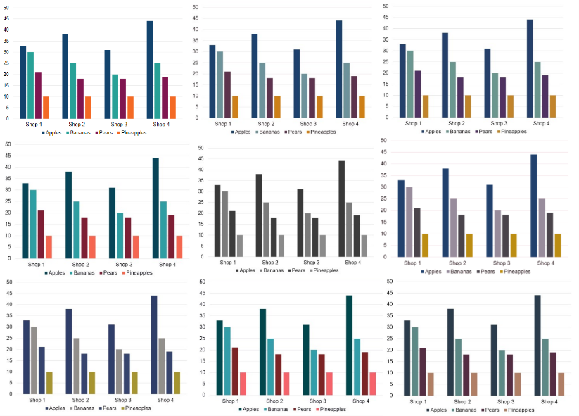
Description of figure 1: bar charts representing different types of colour blindness.
Apart from meeting WCAG, providing a text description can be helpful to people in a number of ways. Firstly, it can provide the equivalent experience for users of screen reader software who cannot see visualisation. Secondly, it helps users who may have difficulty understanding information communicated through charts.
There are also other issues it addresses, such as colour blind users who may be unable to match legend labels or users with low vision who may not use screen reader software, but have difficulty viewing visual content. Finally, some users may just want reassurance that the message they think they have understood is correct.
The text can also be very helpful if the visualisation fails to load due to a slow internet connection, as you will not lose any important information that the chart conveys. The user might be using a device such as a phone that cannot display the chart correctly. It also can provide more context to an image.
Putting the text description in the body
Due to the user needs outlined, we recommend that the text description of data visualisations should be placed in the body text of a publication, not in the ‘alt attribute’ code behind an image.
When the text description is in the body, the ‘alt-attribute’ should be left empty and the image marked as decorative. Otherwise it may lead to repetition and auditory clutter for users of screen reader software. Find out more information about how to write alternative text in our Making analytical publications accessible guidance.
We would also always recommend testing your content with your users. Asking for feedback is so important to make sure your content is clear to everyone, however they choose to access it.
Want to find out more?
We’ve recently launched a data visualisation e-learning course on the Analysis Function website. It looks at best practice approaches for basic visualisations and how we can make them more accessible for all.
The learning is broken into 11 modules that you can take at your own speed. It looks at different chart types and demonstration tables. There are lots of demo videos, exercises and quizzes included to further your learning.
Module 11 provides more information and examples of what makes good alternative text when publishing a chart. There are even some exercises to help you write it, including recreating a chart from a screen reader transcript, so you can see why it is so important.
Best of all it's free and available to everyone.

5 comments
Comment by Paul Graham posted on
Great blog - thank you. I do like the example of using art in a gallery as a way of highlighting the importance of written, descriptive text. I think I might 'borrow' that for future talks!
Comment by Shaun McGarry posted on
this is good practice and would be great for people like me who are blind. The only concern is that when the image is a complex graph or tablular form displaying lots of info, there could be some hesitation to write a few hundred words to fully describe the image. This would clutter up the original design of the web page. I am all for the extra level of details and description in ALL images but perhaps if it is a very complicated image, there should be a "more.." link to allow a popup window to appear with a much more spaced out formatted description of the image and help guide the user to understand what is being portrayed. This would keep the original page neat and tidy but also very accessible with the extra "more.." link too.
Thank You.
Comment by kellyclarkson posted on
Hi Shaun,
Please see a response from the author on this:
Thank you Shaun for your feedback and I think it is a really good point, especially with complex visualisations. We advise that alternative text is placed in the body text of a publication, to make it as obvious as possible to all users that need it. We hope it will also encourage everyone to make sure it becomes an essential part any content they produce with data visualisations. In the future I think it would be great to incorporate different formatting of it like you suggest, or even being able to automate it with tools such as ChatGPT.
Comment by Ann Richardson posted on
Great blog, thank you - and thank you for sharing the link to the free e-learning course as well, that sounds great and I'll be sharing it with colleagues. Like Paul, I think I'll be using your art gallery example in the future too!
Comment by Timothy Swan posted on
In the example alt text for the color blindness chart it only describes the subject matter of the chart, but there's no way for a non-sighted user to get the data that is represented. I'd be curious about how people approach giving an *equivalent* alternative.