Whispers of a new ‘WCAG 2.2’ web accessibility standard flutter between coworkers, within and across the UK government. For teams working on services, the message carries an element of mystery. In any given service, how can areas that need Web Content Accessibility Guidelines (WCAG) 2.2 improvements be identified?
Accessibility is a serious topic, but it doesn’t need to be daunting. It’s possible to sharpen accessible design skills and have some fun at the same time.
So, welcome to the WCAG 2.2 Detective Agency! Let’s get you trained up.
This article – or rather, this detective training course – includes a series of ‘if statement’ clues, a handy magnifying glass and a nifty deerstalker hat (hat and magnifying glass sold separately). The clues can help pinpoint areas of a service that deserve a closer look when making changes to meet WCAG 2.2.
What WCAG 2.2 brings overall
Officially released in October 2023, version 2.2 of the Web Content Accessibility Guidelines (WCAG) adds 9 new ‘success criteria’ for improving web accessibility. 6 of the new WCAG 2.2 criteria are graded at the A and AA level, meaning that they’re considered a requirement for websites and mobile apps in UK government. You can learn more about WCAG 2.2 from the W3C Web Accessibility Initiative (WAI).
Each criterion also comes with an ‘understanding’ document, which offers helpful information on how to understand and interpret the criterion.
A standard like WCAG should not be used as a replacement for exploring the lived experiences of disabled people, but WCAG can be a great tool to nudge teams towards building more accessible web services.
Ready to begin the training?
Helpful clues for WCAG sleuths
There are 7 types of new guidance in WCAG 2.2, spread across 9 new criteria. Pretty much every website and service will benefit from exploring and applying these 7 guidance types.
The challenge lies in identifying where each criterion applies, especially across vast web journeys, sites and services.
Let’s gather 7 ‘clues’ which together form a detective toolkit. These ‘component-level’ and ‘service-level’ clues can help pinpoint areas that deserve attention, allowing teams to more efficiently target effort when working to improve a service.
Component-level clues
Let’s start by examining the individual elements that make up a service, often called components and patterns.
4 of the new WCAG 2.2 criteria can be explored by examining how individual elements behave and interact with each other.
Target size

If an element on the page is:
- interactive
- smaller than 24 pixels by 24 pixels
- in an area crowded with other interactive elements
…That’s a clue! It’s worth examining further.
You can continue the investigation by using the WCAG ‘understanding’ document for WCAG 2.5.8: Target size (minimum).
Dragging movements
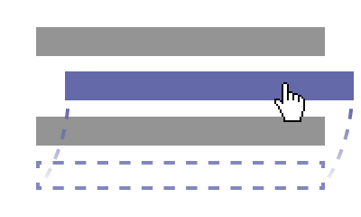
If an element on the page:
- includes a way to interact by activating and dragging
- requires either a mouse or touch gesture to interact
- has no alternative interaction method
…That’s a clue! It may be worth taking a closer look.
You can continue the investigation by using the WCAG ‘understanding’ document for WCAG 2.5.7: Dragging movements.
Focus appearance

If an element on the page has a focus indicator that:
- doesn’t include a portion that completely surrounds the element
- looks very ‘thin’ for the most part
- has a contrast / luminance that is fairly similar to the pixels it replaced or the background around it
…That’s a clue! It may be worth taking a closer look.
You can continue the investigation by using the WCAG ‘understanding’ document for WCAG 2.4.13 Focus appearance.
Focus not obscured
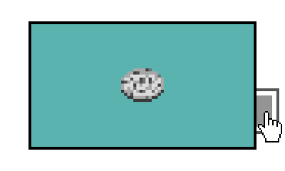
If an element on the page either:
- covers up focussed content
- is ‘sticky’ (for example, unmoving) when scrolling
…Those are clues! It may be worth taking a closer look.
You can continue the investigation by using the WCAG ‘understanding’ document for WCAG 2.4.11: Focus not obscured (minimum).
Service-level clues
Now, let’s step back from individual elements and examine the service as a whole. Not all WCAG 2.2 criteria can be investigated by looking at individual components. Sometimes it requires looking at the bigger picture.
These next 3 clues cover new WCAG 2.2 criteria that relate to how the service is designed.
Accessible authentication
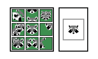
If there’s a login process with any of the following:
- a ‘test’
- something that a user needs to ‘remember’
- no autofill options for inputs
…Those are clues! It may be worth taking a closer look.
You can continue the investigation by using the WCAG ‘understanding’ document for WCAG 3.3.8: Accessible authentication (minimum).
Consistent help
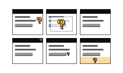
If there’s a series of pages across a service that all include some form of:
- tool for getting ‘help’
- widget for ‘help’
- link to ‘help’ info
…That’s a clue! It may be worth taking a closer look.
You can continue the investigation by using the WCAG ‘understanding’ document for WCAG 3.2.6: Consistent help.
Redundant entry
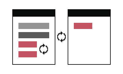
If a single online journey requires a user to enter the same info more than once…
…That’s a clue! It may be worth taking a closer look.
You can continue the investigation by using the WCAG ‘understanding’ document for WCAG 3.3.7: Redundant entry.
A more forensic approach to WCAG 2.2
Hot on the trail of a WCAG 2.2 mystery and looking for more info?
The GOV.UK Design System team ran 3 workshops, to inspect specific WCAG 2.2 criteria where testing is more complex.
Check out the resources from those workshops, if you’re looking to take a deeper dive:
Inspecting ‘Focus not obscured’
- Video recording on YouTube (Focus not obscured)
- Slides on Google Slides (Focus not obscured)
- Slides in HTML format (Focus not obscured)
- Resources on Google Docs (Focus not obscured)
Inspecting ‘Target size’
- Video recording on YouTube (Target size)
- Slides on Google Slides (Target size)
- Slides in HTML format (Target size)
- Resources on Google Docs (Target size)
