
In this latest blog post in our Accessibility and Me series, we speak to accessibility consultant Molly Watt.
Molly has Usher Syndrome, which is the most common form of deafblindness. She was born deaf but with perfect vision. At the age of 12 she was diagnosed with a form of progressive blindness and had lost most of her sight by the age of 14.
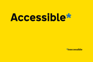
We talk to her about how she uses technology and why she believes that accessibility should mean making things available to everyone.
Tell us about yourself
I’m co-founder of the Molly Watt Trust, a charity set up to raise awareness of Usher Syndrome, accessibility needs and assistive technology. And I’m director of Molly Watt Ltd, where I consult on accessibility and usability.
I’m also an illustrator and the author of 2 children’s books. I’m a regular keynote speaker and an avid blogger.
I collaborate with designers, developers and people working with assistive technology to help them consider accessibility for all. My motto is ‘opening your window to inclusion’.
My whole life revolves around assistive technology and accessibility. Nothing ‘standard’ works for me, hence my interest, passion and determination to make a difference in accessibility.
I was born deaf and I cannot access sound without hearing aids. I also got used to using my eyes to ‘hear’ by lipreading and studying body language, gestures and facial gestures. This meant that when I started to go blind it was more than just going blind – it also meant feeling more deaf.
Acquired blindness is not easy. When you have a progressive condition, there is constant change. There are good days and bad days and it can be very challenging as the world becomes more inaccessible.
Whilst I’m living this today and everyday, I’m aware that ageing brings similar challenges for lots of people. Worsening sight and worsening hearing can bring access issues to many people who might not have previously had them. This is why I believe that accessibility should mean inclusion for all.
What technology do you use?
I use various Apple products because of their built-in accessibility features. Mainly hand-held devices such as iPhones and iPads. I also wear an Apple Watch, which links me to my iPhone and crucial information through prominent haptics. Apple’s App Store gives access to the many useful everyday apps for various sensory losses.
I wear Linx2 GN ReSound hearing aids. These come with an app that enables me to adjust my own hearing and change programs to suit varying environments.
How do you use the web?
I mainly use my iPad when online. Simplistic accessibility such as pinching my fingers on screen to enlarge the text often helps me to get a ‘feel’ for the website. Sadly a lot of websites don't have this enabled for hand-held devices, which is pretty shocking.
I use other ‘zoom’ features on my iPad - such as ‘window’ zoom or ‘full-screen’ zoom. I alternate between the two depending on the website, taking into account things like the number of columns.
I also use ‘speak screen’, a feature built in on Apple devices where a single swipe down the screen will activate a voice to read the content displayed. I often use this when reading articles, or where there is a lot of text and I am too tired to zoom.
I am only able to do this because my hearing aids are connected to my devices by Bluetooth. This means text being read to me is streamed directly to my hearing aids and straight into my ears for me to hear clearly.
What barriers do you regularly face?
Many websites do not have enabled dynamic text, so my ‘large text’ settings on the iPhone or iPad will not override small text on websites. Nor can I zoom manually. On my desktop Mac I can often use keys to enlarge content, but lots of websites haven’t enabled their content to be enlarged on any scale. Which means that often the window will enlarge but the content won’t.
With Apple’s ‘speak screen' and ‘voiceover’ functions, website layouts can prevent the audio being clear to understand. For example, voice activation often won’t register columns on websites and will read text horizontally along the page, rather than vertically in columns.
Many websites have colours and contrasts that can be challenging for people with visual impairments. White backgrounds encourage glare and, for anyone reading at length with any form of backlight, can cause headaches. Many websites have weak contrasts, such a faint grey writing on white backgrounds. Other websites have strange colour selections altogether, encouraging a visual overload and an instant headache for someone like myself.
Many websites now have moving images behind text. This in itself is an obstacle for someone trying to read the text. And it can mean that the text has no contrasting background to make it easier to read. The same thing happens with subtitles on TV.
Some websites also have images as a set background, however when you scroll to read more the text moves up and the picture stays. This confuses my eyes and I'll often get lost in context.
Videos playing, or pop-ups, can also generate confusion for those trying to follow content with zoom/speech. Pop-ups that appear and then disappear are the worst and I'll often panic, thinking I've missed something important.
If a website layout is spread out horizontally and I cannot pinch to zoom, it becomes extremely exhausting to scroll across and back and forth every line to read one paragraph. I often give up with this.
What should content designers, designers and developers be doing?
It's simple: they should consider accessibility right at the beginning. It should never be an ‘add-on’ at the end.
Accessibility isn't just for people like myself with specialised needs. A website is the first door to any source of information for anyone. So make it simple, easy to read and aesthetically pleasing.
This doesn't mean putting in more colours and images. A clear, well-developed website would inspire more people to read in less time without getting stressed or lost or even put off.
Consider features that are already built into computers and hand-held devices that many people already use. Perhaps try these features out yourself.
User-friendly websites would encourage much more usage without a doubt. For everyone.
Follow Molly on Twitter and don't forget to sign up for email alerts.

5 comments
Comment by Ben posted on
Great stuff, Molly. Keep up the great work for raising awareness for inclusive tech.
Comment by Adam Silver posted on
Fantastic article. Keep them coming.
Comment by Samantha Bryant posted on
This is an interesting and inspiring post! Molly, continue to do fantastic work!
Comment by Mallory posted on
Even better, the problems with the text enlargement and zoom aren't from developers not "enabling" the text enlargement-- that's baked into HTML (if it's a website, not an app) for free! Instead, developers *remove* the ability to set or enlarge text, by for example setting px or pt sizes (you can zoom these but they ignore your settings... they ignore my settings!), or setting the content meta tag to user-scalable="no" to prevent zooming.
So this means educating developers and companies doesn't, for these examples, require them to build anything extra at all!
Comment by Gustavo Woltmann posted on
Good that you keep these jobs, this super cool molly