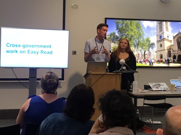
The Department for Work and Pensions (DWP) Customer Accessibility Design Team is transforming the way disabled people access information that is important to them. One of the most exciting projects we have been working on recently is the introduction of new easy read communications standards and products.
What’s easy read and how does it meet user needs?
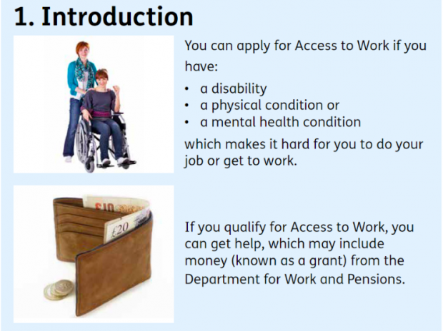
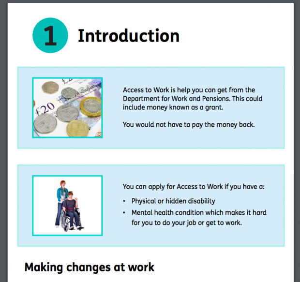
Easy read is an alternative way of presenting information which combines images and text. Images are left-aligned on the page, with supporting text for each image on the right side. This placing gives the reader an idea of what the written text says.
Transforming complex information into clear and understandable text helps all DWP's customers. This is supported by the GOV.UK Service Manual, which explains how accessibility is not just for “people with disabilities – all users will have different needs at different times and in different circumstances”.
Providing information in an easy read format means that our customers are able to more clearly understand our communications and services. This has led to some of our customers being more independent as they no longer have to rely on others to understand guidance or explain a document.
Here’s what we did.
Discovery work
In April 2018 we started our discovery phase to address concerns with our alternative format products. We knew, through partners and independent reports, that customers with learning disabilities, poor literacy or English as a second language are at times confused by complex DWP information and need extra help to understand it.
We researched and scoped what already existed. For example, easy read products from disability charity Change, guidance from the New Zealand Office for Disability Issues, and easy read products on GOV.UK.
We started to build a support network through the cross-government accessibility community, internal colleagues, charities that support people with learning difficulties, and other government departments.
We soon discovered that there were no cross-government easy read standards, no consistency in products across departments, and variations in quality. We also found there were considerable costs across government in outsourcing easy read production to suppliers.
Our discovery found that to make easy read consistent and helpful, we needed:
- skilled people, to build capability in easy read principles and design formats
- proven best practice standards for producing easy read products
- a suite of easy read products across different DWP services
- upskilling and awareness of user facing colleagues in how to provide easy read products
- promotion of the availability of easy read to customers
Prototype and testing

We developed and tested a prototype product for Access to Work. Using a test and learn approach, we applied feedback and results from user testing and consultations to iterate the prototype.
We were hugely helped by learning difficulties charities Mencap and People First. We spent time with both charities in person and on the phone talking through each line, each picture, each page and each element to make sure we met user needs.
Mencap set up user testing with people who have learning disabilities. Early feedback identified we needed to improve the clarity of images and also how well they related to the text. Finding suitable images that reflected some of our processes and the wording associated with benefits was a challenge.
We secured approval from our internal Software Asset Management governance board, which has to approve new technology, to introduce the use of Photosymbols into DWP. Photosymbols is an external picture sharing website that has over 10,000 images taken specifically for use in easy read products.
We secured funding to purchase our own multimedia camera equipment. We set up a green room in one of DWP’s buildings in Tyneview Park where the team is based. This has significantly improved the quality of our products and addressed our testing feedback.
We refined the written text in our prototype based on customer feedback. We made use of several online tools, such as the Hemingway App, which helped us develop a clear writing style for our easy read products and communications.
How it was received

DWP published its first easy read product for Access to Work in January 2019. We received positive feedback from stakeholders and customers. This feedback included: "the best easy read product I've ever seen", “it is really good and very easy to understand" and "at long last something I can understand". Following this successful prototype, we developed easy read products for Support for Mortgage Interest.
DWP easy read standards
From our work, we wrote DWP’s first easy read standards. Mencap, colleagues from HM Revenue & Customs and Department for Health and Social Care endorsed these. We've found our standards are not only used by designers, but also community partners and accessibility advocates when they are speaking to easy read suppliers. At the moment, these are internal documents, but we hope to publish them soon and will be blogging about it then.
Next steps
We are currently developing a set of easy read products for Personal Independence Payment and Universal Credit. Our easy read standards have been adopted even as far as The Department of the Premier and Cabinet in Australia, but we want to push this further.
Our next steps include implementing our easy read standards across all government departments. This will bring consistency and quality to easy read products providing a proven service for the target audience. It also reduces government costs by producing work in-house rather than outsourcing.
Content designers in DWP are working on an easy read HTML template so we can move away from PDF. Currently, our easy read products are in PDF format so we can follow the design format of images left, text right. We recognise PDF does not work for everyone and has limitations so look forward to seeing what we can do HTML-wise, and see this as a work in progress.
If you have any questions, please leave a comment below.
You can contact us at OEDCustomerCommunications.AccessibilityDesign@DWP.GOV.UK


8 comments
Comment by Graham Thomas posted on
Your pictures are poor definition and not an easy read. Are there any better ones please?
Comment by Jane Regan posted on
Congratulations! I first saw your easy read work at Con Con a year or two ago and it is great to see how far this has come. An absolutely game-changing project, and a great result for all your hard work.
Comment by M posted on
Question about the image placement. To make the content/text more accessible to those using screen magnifiers, I understood images should be placed to the right. This allows the text to stay on the left, and be less likely to be missed by the magnified viewing area.
Comment by Ben Railton posted on
Hi there
The standard easy read format is images left, text right so that the images can give the reader an idea of what the text says. We also follow this format when designing our easy read content.
Thanks
Comment by Matt posted on
Strange that an easy read format puts the text after the image. I’d think the focus would be on what the user would read as opposed to a decorative or supportive element
Comment by Suzanne Amos posted on
Easy read looks like a great step forward. I have 7 questions:
Question 1. Can people cope ok with the cognitive load of having to keep one piece of info in their head and apply it to the next bit? (as below):
"You can apply for Access to Work if you have:
- A
- B
- C
that X.
Question 2: the design of your bullets is that the shortest phrase first ("a disability") is first and the longest phrase last ("a mental health condition") - does this ever get in the way of you putting the most common/important information first?
Question 3: Do we need to burden people by telling them which specific government department they need to apply to (DWP)?
Question 4: Have you tested using both 'Access to work' and 'Access to Work'?
Question 5: how far do you work with charities like Scope who have a style guide that reflects the way disabled people refer to themselves?
Question 6: What is the application process for Access to Work? After an easy read description, I hope we are able to send people to an 'easy apply'.
Question 7: Have you tested any easy read alternatives for 'If you qualify for Access to Work'? (ie 'If you get money...' or 'If we give you money...'
Comment by Ben Railton posted on
Hi Suzanne, thanks for your questions. My team doesn't own Access to Work, we just translate existing content into easy read but I've answered your questions as best I can.
1. We tested this product with Mencap and People First and our target audience, no one stated they struggled with that style of wording/paragraphs.
2. We didn't specifically design our bullets that way but thanks for bringing it to our attention.
3. During our scoping and research, we found people want this information so they know exactly who to contact.
4. Not for this particular product, we used the DWP branding on this which is Access to Work.
5. Thanks for the advice, I will look into that.
6. There are several ways you can apply, on GOV.UK. Using the phone, NGT, Video Relay Service. https://www.gov.uk/access-to-work/apply
7. We have tested some of those phrases or similar to your suggestions on other products we are currently developing. This links to answer 3, stating Access to Work ensures clarity we found and reduces any possible confusion.
Comment by Suzanne Amos posted on
Thank you - thanks for taking the time to reply!