On GOV.UK we’ve been looking at ways of improving our finder pages, like services and news and communications. Finder pages allow users to search for specific kinds of content using facets such as topic and organisations to narrow their results.
One of the facets uses a component called an ‘option select’ to display multiple checkboxes in an expandable box. This was built with accessibility in mind – it can be used with a keyboard, the expand/collapse functionality uses a button and the correct ARIA attributes are applied automatically. It looks like this:
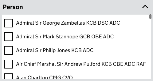
Despite this, the component didn’t work well at scale. Some of the facets it was used for included hundreds of options, so navigating to the last checkbox using a keyboard or screen reader was a slow task.
This presented problems even when using a mouse or a mobile device, as navigating accurately through so many checkboxes became more difficult as the number of options increased.
Worse still, there was no way to search through the checkboxes. Consider how you might try to find a person. Would they be listed alphabetically by their name, or by their title? What if you only knew their surname? Finding them among so many other people could be difficult.
Looking for an alternative
A few years ago, a team at GDS built an accessible autocomplete. An autocomplete is a text input that behaves like a select element, but you can also type in it to filter the results.
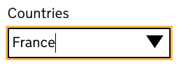
It looked like an ideal replacement for our option selects, as it provided essentially the same functionality but allowed the user to type to filter the available options. This meant that even with a large number of options users would still be able to navigate through them, regardless of how they were using it.
Best of all, it had been built with accessibility in mind, so we could have confidence that it would be usable.
Implementation and iteration
We set to work getting the accessible autocomplete into our finders, by creating a new component and adding the autocomplete code into it. After a bit of work, we had it running, and it was a huge improvement.
Although the autocomplete was working well, there was one big problem – it only allowed users to select a single option, whereas the ‘option select’ component that this replaced allowed multiple selections.
Fortunately, a version of the accessible autocomplete existed that allowed multiple selections, but when we switched to using it, we discovered another problem. In single selection mode the user’s choice remained in the text box, but in multiple mode the selections were shown beneath it, as there was no room for them in the text box.
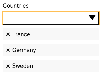
We refer to the user’s selected options as ‘facet tags’. Clicking a facet tag removes it from the user’s selections. This worked well but we had already added facet tags to our finders for the other facets, so with this change there would be a duplication of functionality.

If we were to keep the autocomplete’s facet tags, we would have a confusing interface. The best option was to remove them and use our own, but it was not immediately obvious that selecting an option in the autocomplete had been successful, as the result was an empty text box.
This problem was worse on mobile, where, due to the stacking of the facets above the search results, our facet tags were often not visible at all, so users had no way of knowing that their autocomplete selections had been successful.
To add to our problems, the accessible autocomplete was intended as an isolated piece of code, meaning that there was no API with which to control it. With the need to be able to remove selections from it without using it directly, we were having to write increasingly complex code in order to manipulate it within our finders.
Hard decisions
After much consideration and discussion, we reached the difficult conclusion that the accessible autocomplete wasn’t a suitable solution to our problem. It was a hard decision to make – we had already invested considerable time into it and didn’t have a better alternative.
We returned to the original option select component to consider the problem. Inspired by the autocomplete, we prototyped adding a text input that would allow users to filter the visible options.
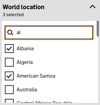
Although the filter control looks simple, we had to consider carefully how to make it perform well and be accessible.
User input is sanitised in order to help users match options more easily; it’s case insensitive, it ignores duplicate whitespace, and matches ‘and’ with ‘&’ and vice versa.
Hidden text is included that announces to screen readers how many matches have been found, how many options are selected, and provides context that something is happening as the user enters text.
Checkboxes that have been checked are always shown regardless of the filter.
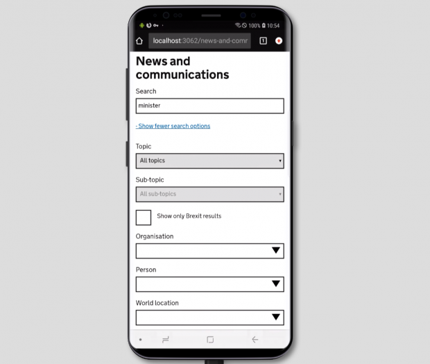
The option select component still has a few other minor accessibility issues, but the addition of this filter has improved it enormously. We’re still testing and improving it, and you can try it for yourself on our news and communications finder.
Conclusion
There are a few important things to take away from this experience.
If something is inaccessible, this can be a problem for everyone. Finding one checkbox among hundreds isn’t a problem only for people using a screen reader – it can be difficult for all of us.
Making something accessible doesn’t necessarily require an entirely new approach. Although the autocomplete looked like the better option, in the end a small change to our original component suited our needs better.
An investment of time and effort into something shouldn’t make it indispensable. Although we’d spent a lot of time integrating the autocomplete into our finders, it wasn’t the best solution to our problem. It can be difficult to discard something, but sometimes it’s the right thing to do.
And in the end, although we didn’t use it in finders, the autocomplete component was used successfully by another team elsewhere on GOV.UK.
Don't forget to sign up to this blog.


1 comment
Comment by Duncan Garmonsway posted on
Is the code available?