
When you hear the word “accessibility” what do you think of? It depends on how it is used, and there are a number of different meanings. Thursday 16 May is Global Accessibility Awareness Day, and the focus is on digital accessibility and inclusion, rather than other crucial elements of accessibility such as building access or inclusive recruitment interviews.
Accessibility matters every day. Awareness days serve as tools to foster improvement and increase engagement, and their significance has grown substantially. There are lots of events happening across the public sector you can get involved with, please see our Central Digital and Data Office events here.
Here are a few simple things you could do, to understand the importance of digital accessibility or to demonstrate this to others who need to know (which is everyone):
- Challenge yourself by avoiding the use of your mouse for a day (or even an hour). Some people solely rely on keyboards, while others use voice recognition software which often relies on things being able to work with a keyboard. As a result, interfaces that rely on mouse inputs pose accessibility barriers for many.
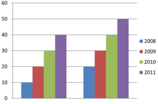
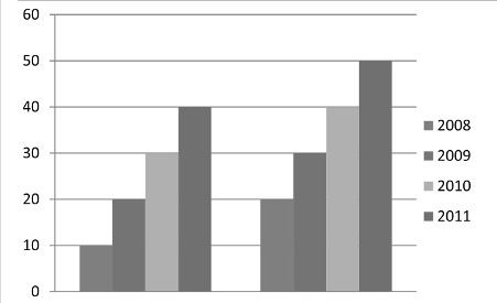
- Print a bar chart in black and white, change your settings or use a browser plugin to view it in monochrome. Can you still understand it or does it rely on colour to show differences in the data? For instance, the original version of this graph employs distinct colours for each bar and its corresponding key. In black and white, it’s challenging to understand without being able to distinguish the colours. Someone who has a colour vision deficiency (often known as colour blindness) may not be able to perceive the differences between some colours. Ensure that you don’t rely on colour alone to convey information by for example adding patterns, or directly labelling things.
- Use zoom in the browser to make text and other things on the page bigger. Does it work? Does it break the layout and make understanding the information difficult or impossible? Do some things get hidden?
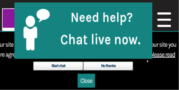
Above is an example of a web page zoomed in, where the Chat live button is obscuring most of the content, and remains at the top and middle of the page when the page is scrolled. Some people rely on the zoom function to be able to read web pages but if they are not designed to accommodate this, it can be an incredibly frustrating experience.
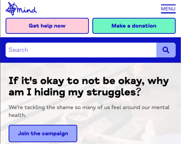
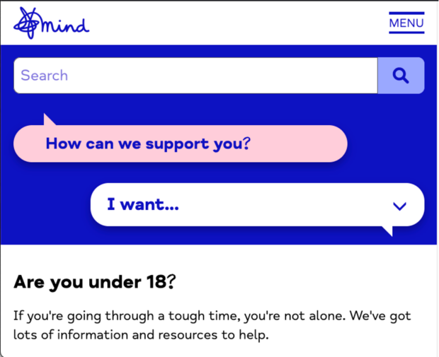
For a better example, let's look at the Mind charity website. They have a "Get help now" button at the top, which is obviously crucial. When you zoom in on your browser, the button stays visible as you scroll down, but if you zoom in too much, it moves out of the way so it doesn't cover too much of the content.
Find out more
If you want to find out more about common web accessibility problems that create barriers, visit the Accessible University. It is a fictional inaccessible university home page, together with an accessible version of the page with the issues fixed. It also has examples of accessible and inaccessible document formats.
As we celebrate Global Accessibility Awareness Day on 16 May, many events and activities are happening around that date to promote inclusivity and accessibility for everyone. Look out for events in your own organisation and beyond and join in the fun!
We also advise you to check out our Government Resources for Accessibility document which may be useful.
Join the conversation on Twitter with Richard at @accessibleweb and you can contact the CDDO accessibility function at accessibility@digital.cabinet-office.gov.uk.

1 comment
Comment by HENIO HENRIQUE OLIVEIRA DOS SANTOS posted on
It's fantastic to see a focus on digital accessibility for Global Accessibility Awareness Day! These practical challenges really highlight the everyday barriers people face and encourage us to design more inclusively. Awareness days like this play a crucial role in fostering greater understanding and engagement across all sectors.