Get involved with Digital Accessibility Week 2026
Get involved with Digital Accessibility Week 2026
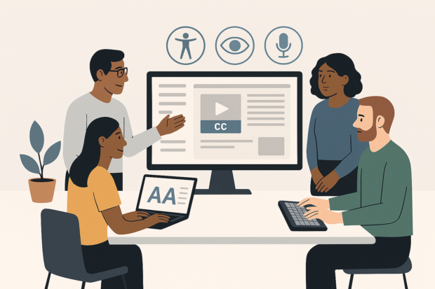
Digital Accessibility Week 2026 is a cross-government online event taking place from Monday 18 ending on Thursday 21 May which is Global Accessibility Awareness Day (GAAD).