I’m a developer in the GDS Accessibility team and I’ve been exploring the different ways users can change the colours of a website.
This blog post looks at the methods with which users might change colours and what the people creating websites need to look out for.
Why users change colours on websites
Some users choose to change the appearance of websites to make them easier to read. For example, a user with low vision might increase the font size or a dyslexic user might change the font itself.
Another change that users might choose to make is to alter the colours used by websites. There are a lot of different user needs for this and there are a number of different ways to make those changes. Marian Foley wrote about how and why she changes website colours in Firefox.
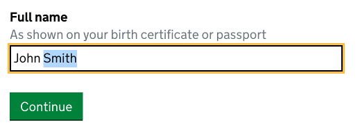
A recent piece of work led me to look into this. A test on GOV.UK had found that buttons stopped looking like buttons when you changed website colours, because they had neither a background colour nor a border. So we decided to investigate this further.
The different methods for changing colours
I started to explore the different ways with which you can change the colours of a website. Here are the methods I found:
- you can change the browser setting for text and background colours and visited and unvisited links in Firefox and Internet Explorer
- you can install a browser extension in Chrome to change colours, for example ‘High Contrast’, ‘Midnight Lizard’ or ‘Pro Visu Look’
- you can change the appearance of your operating system, including the appearance of most software, via a system setting: macOS, iOS and Android let you invert the colours and change to grayscale, but Windows gives you many more options with which you can change the colours of lots of different elements
- you can use third-party software: screen magnifiers often include the option to change colours as well, some literacy software can help you tint your screen, and then there is other software which allows you to do either or both
- user style sheets (either via browser settings or a browser extension) might be quite technical to use, but services like userstyles.org and freestyler.ws make it easier and sometimes have good solutions for specific problems on specific websites
- hardware monitor settings can be adjusted to change brightness, contrast, colour settings and other things
- physical coloured overlays can be put on screens to give them a tint
Some issues I found
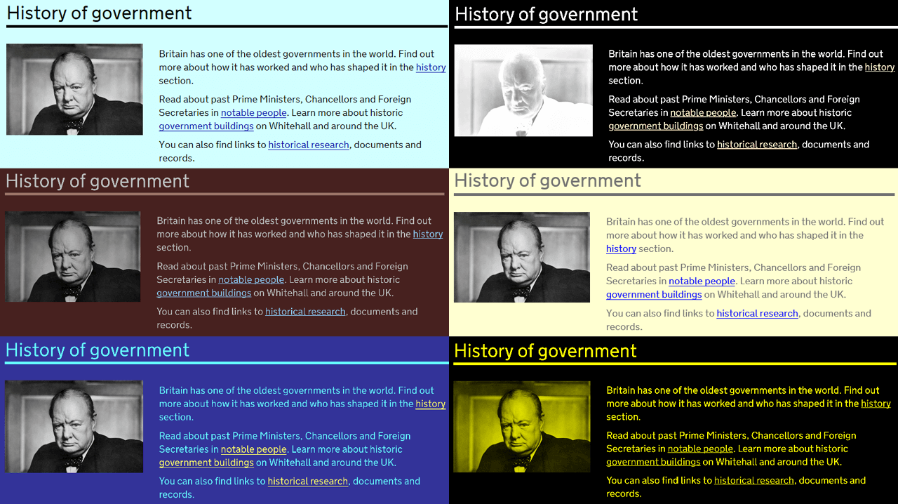
I tested a page with some input fields and a button in the GOV.UK style in various combinations of the above, including light and dark colour schemes.
While I was doing this I found a few bugs:
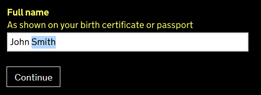
- that buttons become unrecognisable was the original issue I looked into (this is now fixed)
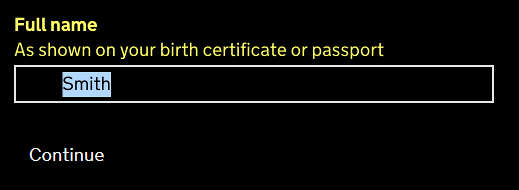
- that input content becomes invisible was a much worse issue I found - while unrecognisable buttons can be annoying, if the text you type into a text field is completely invisible, it presents a proper barrier (this is now fixed in GOV.UK Elements)
- that any input can become completely invisible is a specific bug in Firefox (I’ve raised this as an issue with Firefox)
What people creating websites need to think about
You should generally test websites in the browsers and settings that most of your users use. But in this case it is difficult to know which method people are using to change website colours. There is very little research into the subject. And it is impossible to know from Google Analytics if someone is using a specific setting or tool to adjust how a website is displayed.
However, there are some simple things you can do to help you find a number of issues. It might be helpful to test a light and dark colour scheme via the browser settings in Firefox and one of the ‘high contrast’ colour schemes in the Windows system settings at least in Edge.
The Website Content Accessibility Guidelines specify that users must be able to select foreground and background colours. It is therefore important to generally make sure a website is as flexible and adjustable as possible. One step to achieving that is to always style background and foreground together.
Some background colours can disappear when the overall colours are changed. This is especially troublesome when a border has been removed by a website from an element which usually has a border. Or when you give something a background colour which usually doesn't have any. You can use a transparent outline to let it re-appear in the general text colour only when colours are changed.
Carrying out more research
Because there is hardly any research out there about what is actually being used to change website colours and under which circumstances, we will add some questions around it into our next assistive technology survey. We published results of our last survey in November, so it will be a little while until we conduct the next one.
In the meantime, please tell us about your setup in the comments. Which of the methods do you use? Or do you know of a method we haven’t listed?
Which colours are you changing to? And do you encounter any specific problems on GOV.UK when you change your settings?
Follow GDS on Twitter and don't forget to sign up for email alerts.

3 comments
Comment by Amelia Bellamy-Royds posted on
One "change colour" method not mentioned: selecting text. It is the quickest way to alter the text colour and contrast on a problematic website, for someone who only sometimes has problems with colour contrast. I personally have great difficulty with white text on black backgrounds, and the select-all keyboard command helps me read many such sites. Even though the default selection style in most browsers (white text on blue) isn't great, it is still an improvement on some sites.
For the web developer, this means being careful about custom ::selection styles. You of course need to have selection styles that are clearly distinguishable against your site's colour scheme (while not clashing horribly). But maybe don't get too fancy, and don't change it at all if your don't have to. Because it's dangerous to second guess what changes other people will need: some people will want to increase contrast, some to reduce it.
Comment by Margaret Wood posted on
It's really great to finally see recognition that there are all sorts of visual problems that web designers need to be aware of.
I have two different problems.
1. I am very short-sighted. This means that the glasses I wear to correct my vision make everything significantly smaller. I need to increase the font size to compensate. On many websites this results in different sections of text overlapping each other.
2. I have problems with light sensitivity and sensory overload. The default background on most websites is too bright for me, and sites with a lot of icons are painful to look at. I set my browser to use a dark blue background, with light grey text and link colours set to light pastels.
This means that a) any information conveyed by a local change in the background colour (e.g. where to enter text, which days are already fully booked ) is lost.
b) icons with a transparent background become very hard to see because they are too similar to my default background
c) text on top of an image (never a good idea) becomes impossible to read
I don't visit GOV.UK very often, as I now live in Australia, but as an ex-pat approaching retirement I may be visiting more often, so it is good to know that you are taking my problems seriously
Comment by Bruce Lamden posted on
Hi. firsstly this comment form fails F24 since the background colour has not been set and so I get black text on black (Imodify my Windows Theme to white text on black).
Using the Windows High Contrast themes is NOT a good text for this problem . These are not true themes. They overide all colours set by a web site. A true theme only fills in the missing colours (often the background colour of form fields and drop-down lists is not set). You need to use the wndows Display Color editor to create a test theme. Also the Wndows High contrast "themes" strip out graphics and this includes a lot of navigation buttons. So the Windows High Contrat "themes" are not usable in the real world.