Accessibility means making sure there are no barriers that might prevent someone from accessing or using something.
Accessibility should be a part of everything we make and deliver. This includes events and presentations.
Events and presentations are a great way of showing new work, sharing learnings and helping people to build capability. So we need to make sure that no one is excluded from them.
If you’re running an event or giving a presentation, here are some things you can do to make sure they are as accessible as possible.
If you’re running an event
Before the event
- check whether any attendees and speakers need anything to be able to participate in the event – you could add some text to the invitation or the registration page asking: “Is there anything we can do to enable you to be able to fully participate in this event?”
- check that the venue is accessible – it should be wheelchair accessible and any stairs may need rails
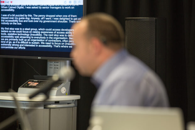
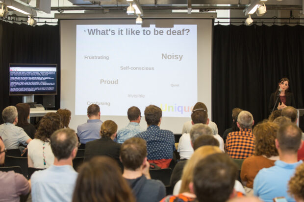
- consider live captioning – having live captioning can make sure people with hearing impairments can access the event; it will also mean you will have a transcript at the end of the event – live captions cost roughly £110 an hour
- make sure that the venue has a hearing loop and that you know how to connect the sound system to it
On the day
- check the hearing loop and make sure that the audience has joining details for it
- make sure that you can control and adjust the lighting if necessary
- make sure you have a second and even third microphone with runners for getting audience questions
Making things accessible for your speakers
Bear in mind that speakers might have accessibility requirements too. Here are some things to consider:
- any staging may need to be wheelchair accessible
- any steps may need rails
- lecterns and microphone stands should ideally be height-adjustable, and this should be easy to do as it may need to be switched between speakers
Making things accessible for remote audiences
If you have a remote audience dialling in to the event then you need to ensure that the event is accessible for them too. Here are some ways to do that:
- test the setup in advance and make sure there is internet connectivity
- make sure that the camera feed has both the speaker and the slides in shot, and make sure the speaker is not standing in the way of the slides
- consider sharing slides directly to the web feed – this will give the clearest view but of course will mean remote participants can’t see the speaker's face or gestures
- ensure remote participants can submit questions and take part fully in Q&As and feedback
If you’re giving a presentation
When you’re writing the presentation
Make sure that your slides are clear and easy to read. At GDS, we’ve designed our slides template to be as accessible as possible. There are a few things to take into account:
- make sure there is a good contrast between text colours and background colours – our slides use black on a grey background or white on a dark blue background
- avoid white backgrounds because of glare – this is why we use a grey background for black text
- if you are using text over an image, make sure the image is dark enough to ensure contrast and simple enough not to distract from the text
- use large type sizes and keep the typeface simple – we use Helvetica Neue at 32pt or 63pt
Using videos
If you’re using a video as part of your presentation, there are a few things to think about to make sure it is as accessible as possible:
- ensure that all videos have captions – these should be clear and large enough to see from the back of a large room
- ensure that any visual content in the video is described in the audio – if it isn’t, then you should describe it to the audience yourself
- check video sound levels in the room before the live presentation
When you’re presenting

There are a few things to think about when you’re giving your presentation. This advice will help make your presentation more accessible. It will also make it easier for everyone in the audience to follow your presentation – whether or not they have access needs.
- if you’re using a hand-held microphone, keep it close to your mouth at all times – imagine you’re eating a rapidly melting ice-cream on a hot day
- if you’re using a fixed microphone, try to keep as near to it as possible, even when you’re addressing someone in the audience
- if you’re using images or video in your presentation to convey essential information, make sure you also explain that information verbally
- if you’re doing a Q&A with the audience, then make sure the venue has a spare microphone for questioners to use – if there is no microphone or if the questioner doesn’t speak clearly into it, then make sure you repeat the question into your microphone
Do you have any tips on making events and presentations accessible? Share them in the comments below.


5 comments
Comment by David posted on
Alistair, good list, but you have ignored the communication needs of blind and deaf-blind participants.
Just some thoughts for the inclusive age:
* Provide indoor beacon bluetooth smart phone app navigation (i.e. Blindsquare), or offer human assistance for guiding.
* Ensure pathways and halls are clear of wires and obstacles.
* If possible provide a real time audio description channel (via bluetooth or wireless) for smart phone listening, or an audio channel to broadcast the speaker.
* Ensure the realtime text captioning is screen reader accessible (iOS Voiceover and Android Talkback).
* Provide a point of orientation for the speaker on the stage (podium or chair).
* Ensure the presentation material is in a downloadable WCAG accessible digital format.
Comment by Suzanne Amos posted on
Very useful checklist - thank you!
Just need to get over my fear of public speaking first 🙂 and then buddy up with a colleague to help out with all the tech check aspects.
Comment by Aurora Betony posted on
Many thanks for this blog post Alistair.
I'd like to add to it 5 things you can do to make an oral presentation accessible to dyslexic people.
1. Cater for all learning styles. (This will help everyone, not only dyslexic people, because everyone learns differently). In other words, give your audience content to listen to (vary this by including some audio clips of other people's voices); look at (present information visually wherever possible e.g. timelines, sketchnote summary); and do (e.g. distribute your slides in advance so that people can bring a copy and add their own notes). If you can sing, sing a summary of the bit of your presentation that you most want people to take away with them. Use a tune you already know.
2. Generally, speak at a steady pace. Leave at least a few seconds' gap for processing at the ends of sections when you don't say or do anything. Vary the speed, volume and pitch of voice you use.
3. At the beginning of your presentation, give the gist of what you're going to say.
4. Dramatise some of your content e.g. tell stories about real or imaginary people, ideally that move your audience emotionally; or go into role and do a monologue or dialogue with others. You may be able to use video or audio clips that other people have made for this.
5. Let anyone make an audio recording of your presentation for their own personal use.
Comment by David Vosnacos posted on
David,
Good points. And here are some additional considerations I usually employ:
* Orientate the audience to the position of the lectern by providing an orientation to the room using a clock face technique. Step off mic to give this exact location: the position of the sound system speakers often doesn't give this context.
* Orientate the presenter to the layout of the actual lectern particular where the static microphone is located.
* Conduct a roll call, using a series of roaming microphones, of all those in audience to orientate those present who else is in the room. (name badges aren't accessible to everyone) Typically this can take up to 5 minutes for an audience of up to 100 people.
* If an audience member provides a specific lapel microphone ensure the presenter uses it. (for example some cochlear implants may not use any other means such as a loop or T switch configuration) Ideally though have this patched into the audio mixing desk so all audio is accessible: from the the presenter, their laptop etc.
* Make sure all questions from the audience go through the roaming microphones: no exception.
Comment by Mike Hughes posted on
Two things to add.
1) The myth of learning styles is slowly being debunked internationally but it's a long battle. The evidence suggests that whilst people have a preferred learning style that isn't necessarily the most productive process for them. Most people really do learn through simple bite-sized chunks; repetition and practical examples.
2) In terms of accessibility on the day of an event from a visually impaired perspective there is no mention of
a) signage. Venues need checking externally and internally and additional signage may need to be placed. Especially important in lobbies; dark corridors and so on.
b) directions. Making a venue accessible is all very well but if the details on how to get there include a poor, small, blurred map with no instructions on coming by car, public transport etc. then you've an instant barrier to attendance if people believe something is more difficult than it actually is. Initial materials need to be produced in an accessible format rather than requesting if people need that. Producing something in 16 point doesn't cost much more and can make a huge difference from the outset.
c) Nowadays there is considerable emphasis on Wi-Fi accessibility. This usually misses the point. Local Wi-Fi is usually bandwidth limited and not fit for purpose. More important is that a venue does not prevent access to 3G or 4G so people. A room which is a dead zone should simply not be used.
3) Disappointed to see the comment about text overlaying images. Please don't attempt to make it contrast well. You're doing a presentation and your concern should be for your audience not some stylistic foible. Text simply has no need to overlap images and presenters should be asked to make sure it doesn't.