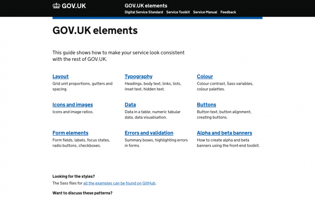
At GDS we’ve brought together a range of elements that teams can use to make sure their services look and operate consistently with the rest of GOV.UK.
This includes things like typography guidelines, form elements and standardised buttons. We currently host these things on GOV.UK Elements and we’re building the GOV.UK Design System, which is where they will sit in future.
Because these elements are being used by different teams across government, we need to make sure that accessibility is – as far as possible – built into them. We also want to create a foundation for the GOV.UK Design System team, who can continue to make sure they’re accessible.
So my Accessibility team colleague Richard Morton and I carried out an audit of all the things we have in GOV.UK Elements. We fixed what we were able to and reported what we weren’t.
Here’s what we did and what we found:
Testing the elements
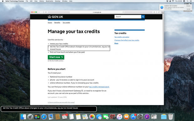
We wanted to look at more than 40 different elements and components. And we needed to test a lot of these elements in context. For example, it is very difficult to test an input field on its own – you need to have it in a form with all the usual interaction in order to test it more reliably. To do this, we built a very simple prototype to test all the elements on.
We then carried out a range of different tests:
- first, we checked all the prototype pages against the WCAG guidelines – we looked at every single success criterion to see if there was a pass or a fail
- we then tested the pages with various assistive technologies – we have 2 laptops in our office that have the necessary technologies, including multiple versions of JAWS, NVDA, Dragon NaturallySpeaking and ZoomText and we also tested in VoiceOver on iPhone, iPad and Mac
- we ran some other tests – including inverting colours with ZoomText, modifying colour schemes with browser settings, using a monochromatic filter, checking that links make sense out of context, and checking HTML validity and if things work without JavaScript, without CSS and without both
- in a few complex cases, we also did some user research with screen reader users
We ended up investigating 38 different issues. The vast majority of them (24) turned out to be about forms.
Some of the things we found and fixed
JAWS and NVDA in IE11 couldn’t open content in the progressive disclosure element
Our progressive disclosure element is used for hiding content on page load and then showing it when a user is interested and activates the trigger. When using JAWS or NVDA in IE11, this component didn’t work.
This is because the component was triggered using the ‘keyup’, ‘keypress’ and ‘mouseup’ DOM events, but JAWS and NVDA in IE11 only recognise the ‘click’ event. We could quickly fix this by simply changing the event handler.
Errors in forms were not always clear to screen reader users
When a form can’t be submitted due to an error, it is important that the user knows as soon as possible that something went wrong. To make sure that happens, every error is highlighted within the form, there is a big error summary box at the top of the page and we move keyboard focus to it.
Despite this, we found that browser or screen reader bugs meant that these things were not always obvious to screen reader users, who would have to peruse the page fully to pick them up.
So we implemented one additional way for users to be alerted to the problem on the page. We added the word “Error” into the page title whenever there was a problem on the page. For many screen readers the page title is the very first thing they read out.
It’s a tiny change with a big effect. When we user-tested this, the positive reaction was overwhelming.
Screen readers read headings out twice
We found that headings on form pages were often read out twice by screen readers. This was happening when we followed the ‘one thing per page’ pattern and had a page with a single question as the h1 as well as the hidden legend.
The question h1 heading – for example ‘do you already have an account?’ – would be at the top of the page and would be followed by 2 radio buttons saying ‘yes’ and ‘no’, and a ‘submit’ button. The problem arose because you still need a legend for screen readers to explain what the radio buttons are referring to.
Solving this proved quite tricky. We felt it would be best if the legend and the h1 were the same. So why not move the heading into the legend? We started to explore that option, which would intentionally produce invalid HTML. As we were doing this, though, the W3C made it valid in the HTML5.2 spec. This solution wouldn’t have been possible without that change in the spec.
It might still show up as invalid in older validators or if you’re validating against an older HTML version. But when we tested this in all the assistive technology available to us, it behaved the best out of all alternatives we tried.
Hacking the HTML can be ok
You should generally avoid having any invalid HTML because it can cause unpredictable issues in anything that consumes it, including browsers and assistive technologies. But sometimes it is not just ok to have invalid HTML, it can also make the user experience better.
For example, the ‘autocomplete’ attribute on inputs used to be invalid but it was generally accepted that it was still better to have it for security reasons.
The only invalid HTML that still exists in GOV.UK Elements is the pattern attribute on the date pattern example. We’ve kept this in because iOS devices still don’t show the number keyboard on a number input. This little hack(ish) forces the number keyboard to be used.
We believe this is a good use of a hack because it provides a much better user experience than using the standard keyboard. And we haven’t found any negative effects in browsers and assistive technologies we’ve tested.
To make this clear, we documented why we include this hack.
Browser bugs
Out of the 38 accessibility issues in GOV.UK Elements we found and investigated, 12 were about actual problems with the code, 8 about guidance, 2 were non-issues and 16 were about browser bugs.
Whenever we encounter browser bugs or bugs with any assistive technology, we make sure to report them. For example, we did this when we discovered that some elements would become invisible or unrecognisable when changing colours.
Some organisations’ bug trackers are open (like Mozilla’s bug tracker) but many are not, which makes it difficult to track the report’s progress. This article on Mozilla’s developer site lists where to report bugs.
During testing for accessibility issues in GOV.UK Elements, we found 19 vendor bugs and reported most of them:
- 11 in VoiceOver (6 in iOS and 3 in macOS, 2 in both)
- 3 in IE/Edge
- 2 in recent Dragon NaturallySpeaking and 2 in an older version
- 1 in Firefox
- 1 in an older version of JAWS
(These numbers don’t add up because for some issues we reported more than one bug and some bugs were happening in more than one browser or assistive technology.)
Build in accessibility from the start
We want to support teams across government as much as possible to build accessible services. That’s why we’ve worked so hard to make sure the elements and components we publish are as accessible as they can be.
But using these tools alone won’t prevent accessibility issues. Teams should also make sure they are running their own testing on services as well as carrying out user research with people with disabilities.
Making things accessible is the job of all of us. And only by working together and supporting each other can we ensure that government services are accessible by default.
Follow GDS on Twitter and don't forget to sign up for email alerts.

2 comments
Comment by Marc posted on
I've seen on http://govuk-elements.herokuapp.com/form-elements/ under "Labels" that it says 'avoid colons at the end of labels'. Could you explain what the reasoning is behind this?
Comment by Paola Roccuzzo posted on
Hi Marc,
the short answer is: best practice [2].
The longer answer requires looking at the guidance from two perspectives: grammar and content design [1].
From a grammatical point of view, the use of colon is codified, and interestingly enough it's very consistent across all languages using the latin alphabet. You use a colon when you want to introduce a list of things (see [1]), or when you want to connect two independent clauses and the second one is an explanation of the first one (see [2]).
There are also other uses, but the main thing is: a colon, like all punctuation symbols, was born out of necessity. We needed a way to catch the reader's attention in some specific moments, and tell them to make a pause, or to wait for an explanation, or that we're done talking about something.
That's why you don't need a fullstop after headings. The signal of "this sentence is finished, now we move on to the next bit of content" is made quite clear by format and position. A fullstop (or any other sign of punctuation) is not necessary.
When you apply this to design, it's quite clear why you don't need a colon in a field label. It's not necessary, as the label is the equivalent of the heading for a field.
From a content design perspective there's also the added issue of adding an extra character to the label.
That label might not be hardcoded, but might come from a datasource in the back-end. Introducing a colon in the label adds an unnecessary extra step of either hardcoding the colon or introducing the colon in the dataset. This is against design best practices.
Hope this helps!