In the GOV.UK Publishing Frontend team we’ve worked to turn small, repeated elements of our pages into components. A component is a chunk of code written in a consistent way that can be easily reused across GOV.UK without having to duplicate anything.
This consistent approach includes the structure of the code, tests, file locations and documentation. It also includes accessibility criteria that make sure the component is as usable as possible. Using a consistent approach makes it easier to maintain and improve components and pages.
Making web pages that work across every current browser and device is difficult. Making those pages accessible adds another level of complexity.
Part of the problem is that much of what defines ‘accessibility’ can’t be tested automatically and isn’t based on a specific, ‘one-size-fits-all’ solution. For example, a bug in JavaScript will cause an error that can be diagnosed and fixed, but an accessibility issue such as a confusingly worded sentence is harder to identify.
Testing with real users in real-life scenarios is often the only way to be certain that a page or a component is truly accessible.
One of the components we recently worked on is the next/previous navigation that occurs at the foot of some GOV.UK pages. Here’s how we made this component accessible to screen reader users and what we learned about accessibility in the process.
Uncovering the issue
The next/previous navigation shows users what pages come before and after the page they are currently on:
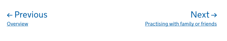
When we tested the component using a screen reader we noticed a possible issue. For sighted users the distinction between the navigation text (‘Previous’ and ‘Next’) and the link label text (‘Overview’ and ‘Practising with family or friends’) was clear. This was because the font size was different and the two pieces of text were on separate lines.
A user who relied on a screen reader didn’t have that distinction. There was no pause between the navigation text and link text when they were read out, leading to a possible confusion.
Testing screen readers to explore the issue
Most screen readers recognise punctuation. We decided to see if there was any way we could use some to provide an audible pause between the navigation text and the link label text. This punctuation would have to be invisible to all but screen readers so as to not change the appearance of the component.
We used VoiceOver (the built-in screen reader for Mac), Jaws (Windows), NVDA (NonVisual Desktop Access for Windows) and Narrator (the built-in screen reader for Windows) for our testing. We built a simple page containing 11 variations of the component with various punctuation characters invisibly inserted to see how each screen reader would handle them.
We tried the following:
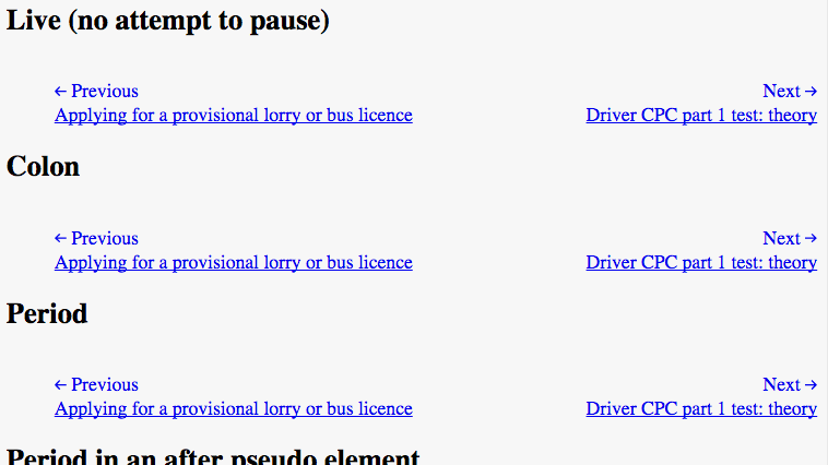
- no punctuation (the current, live version of the component)
- punctuation characters in a visually hidden element
The punctuation characters we tested were colon, period, comma, dash and a unicode character for a right arrow. We listened to each screen reader as it navigated our test page, noting whether or not it paused at the required place.
Screen reader behaviour
Before we get to the results, it's worth pointing out some screen reader behaviour we noticed during testing that may be unfamiliar to you.
Some screen readers pronounced certain punctuation characters and others didn’t. For example, Jaws pronounced colons and semicolons but NVDA didn’t, instead inserting a pause.
VoiceOver had quite complex rules around if and how it pronounced the period character. For example:
- a normal end to a sentence followed by another sentence, such as “ending. This” is pronounced “ending (pause) This”
- “. this” is pronounced “dot this”
- “. This” is pronounced “full stop This”
The second 2 examples aren’t likely to appear on most web pages but they show the value of checking your content thoroughly. Even if text makes sense when you read it, this doesn’t mean it will come across exactly as intended when read by a screen reader.
Some screen readers pronounce the first word of a sentence in a way that makes it clear that it’s the start of a sentence. This helps the user to understand the structure of the text, particularly if they have increased the reading speed. Jaws appears to rely solely on this when reading aloud as it does not pause between sentences.
You can read more about screen reader behaviour in our blog post on how to create content that works well with screen readers.
The best solution
We found that most of the screen readers behaved differently when using hidden punctuation. Sometimes they would pause, sometimes they would pronounce the character out loud, or sometimes they simply wouldn’t pause at all.
The punctuation characters that most consistently produced a pause were colon, full stop and comma. The comma produced a pause consistently in all screen readers that we tested. Based on these results, it seemed a hidden element containing a comma would be the best solution. Unfortunately accessibility isn’t always that simple. Grammatically speaking, a colon makes more sense. Contrast these two examples:
- Previous, Terrorism
- Previous: Terrorism
Although some screen readers will pronounce the colon rather than pausing, we decided to implement this solution as it makes more sense.
As it says in the blog post about creating content that works well with screen readers: "Don't write content that works specifically for screen readers, write content that works well for everyone."
The value of accessibility
If you’re a screen reader user you can hopefully appreciate this small improvement on GOV.UK right now. We’ve also made sure that this work is clearly documented so that it can’t be overlooked and accidentally removed in any future work.
This may seem like a lot of effort, but the solution was simple to implement and we learned a lot about screen readers in the process. Accessibility is often disregarded as unnecessary or too complicated to do right, but hopefully this example has shown that it’s worthwhile and achievable.
This work was done in collaboration with the cross-government accessibility community, who gave considerable insight into this issue. This included insight from people who use a screen reader on a daily basis. We’ll be continuing to look at how accessibility can be improved in small and large ways across GOV.UK.
If you’d like to read more about our work with components and accessibility, take a look at our component guide for government-frontend.
Follow GDS on Twitter and don't forget to sign up for email alerts.

3 comments
Comment by Ed Price posted on
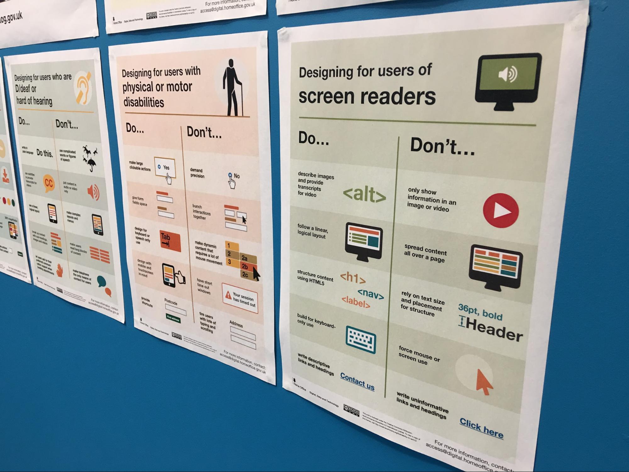
Are the posters at the top of this post available to download?
Comment by Angus Montgomery posted on
Hi Ed,
Yes they are.
There's more about the posters in this blog post: https://accessibility.blog.gov.uk/2016/09/02/dos-and-donts-on-designing-for-accessibility/
And they are available to download here: https://github.com/UKHomeOffice/posters/tree/master/accessibility
Comment by Trevor Saint posted on
Thanks for this insight. This will prove useful for patterns we have over at HMCTS as well as other projects.