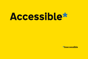
By default on GOV.UK we try to use the most accessible colours, however there are still times where some users may need to change them.
For example, those who are sensitive to light may find a white background too bright, or a user with dyslexia may find certain colours easier to read than others.
We’ve researched and spoken before on the Accessibility blog about how and why users change colours on websites and some of the issues teams need to think about.
On the Design System team we aim to make any components in GOV.UK Frontend as accessible as possible, so we took our previous research and tried to improve the latest version.
I’ve picked out a few examples below to demonstrate some of the improvements that have been made.
Back link component
The back link component has a triangle arrow icon which we implemented using the CSS triangle method.
This method relies on manipulating the CSS ‘border’ property to make make certain sides of the border invisible.
When overriding colours the previously invisible borders become visible, resulting in a rectangle being rendered where the triangle arrow should be.
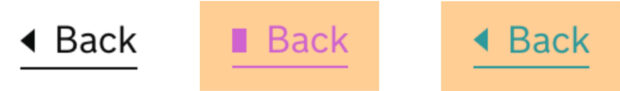
By adding ‘clip-path’ we can draw a polygon that matches the original triangle to ensure the rectangle does not appear.
Note that ‘clip-path’ only works in some browsers which is why we're using both the CSS triangle method and ‘clip-path’.
To make it easier to make triangles like this, we have created a SCSS mixin.
Breadcrumbs component
The breadcrumbs component has chevrons that separate each link.
![]()
The original version made use of PNG images, which disappear when colours are changed.
![]()
To fix this we made use of CSS again to create the chevrons but you could also consider using SVG icons here.
![]()
Read the code for the breadcrumbs example in GOV.UK Frontend
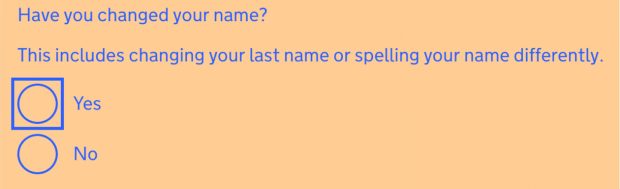
Radios component
The radios component predates GOV.UK Frontend and is a good example of ensuring changed colours are respected.
When we brought the radios component over we found there were opportunities to improve the focus indicators.
Focus state is important for keyboard users to know what they are interacting with - without focus state interactions it’s not clear what part of the interface you will interact with when pressing ‘enter’.
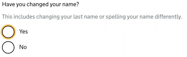
Previously, when colours were changed the focus indicator was lost because it relied on ‘box-shadow’ as ‘outline’ does not allow for curves.
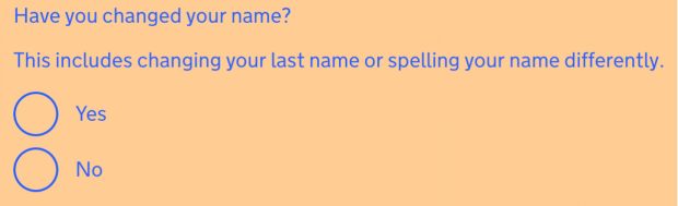
To ensure an indicator is visible, we included a transparent outline in addition to the box-shadow which is shown when colours are overridden.
Read the code for the radios example in GOV.UK Frontend
Header component
The header component includes the GOV.UK logo, but the icon disappears when overriding colours as it was originally implemented as a PNG image.


To fix this, we used an inline SVG that makes use of currentColor for it’s ‘fill’ property.

Read the code for the breadcrumbs example in GOV.UK Frontend
Panel component
The panel component uses a solid background to make it stand out, but it’s lost when colours are changed.

We chose to add a transparent border that will be shown in every scenario.
Read the code for the panel example in GOV.UK Frontend
This blog post features just a small fraction of the work we’ve done to make our components more accessible. Check the GOV.UK Design System for more.
Nick Colley is a Frontend developer working on the GOV.UK Design System.
Subscribe to this blog for updates.

7 comments
Comment by Pail posted on
Thanks for sharing Nick. There is a range of approximately half a dozen high contrast and colour possible settings for a wide range of vision impairments. How have you validated for every one? Do you use some kind a matrix to check all types when QAing?
Comment by Nick Colley posted on
Hey Paul,
Thanks for your comment 🙂
We have been testing by changing colours in Firefox, by enabling 'High Contrast' mode in Windows and by using the High Contrast plugin for Chrome.
You can see more on how we test assistive technologies in the GOV.UK Frontend readme: https://github.com/alphagov/govuk-frontend#assistive-technology-support
We would welcome any input on variations you think we should be testing and validating, if you have any ideas feel free to get in touch with the team by emailing: govuk-design-system-support@digital.cabinet-office.gov.uk
Nick
Comment by Kim McGreal posted on
Thanks for this post. I've been using more CSS, but it didn't occur to me that some elements of my design might not be accessible if the colours are changed. Definitely food for thought.
Comment by Francois Jordaan posted on
Can you just explain what makes the transparent borders become visible when users change their colours?
Comment by Nick Colley posted on
Hello Francois,
I'm not entirely sure why browsers override colours in this way, I imagine it's for pragmatic reasons that they have to override so much.
In terms of the logic when overriding colours the browsers seem to do the following:
1. force all text to be the colour specified by the user
2. force all borders to be the same colour as the text
3. remove all backgrounds to be the colour specified by the user
If I were to implement this logic in CSS this would look something like:
```css
html {
color: white !important;
background: black !important;
}
*, *::before, *::after {
color: inherit !important;
border-color: inherit !important;
background: inherit !important;
}
```
Comment by Francois Jordaan posted on
Thanks Nick!
Comment by Mike Gifford (@mgifford) posted on
It is great to have more support for users to customize their colors. Even things like Windows High Contrast Mode throws off many sites. Many users aren't technical enough to set up their own custom CSS. That's one of the reasons why I suggest that more sites take up a Preferences Editor like this https://build.fluidproject.org/infusion/demos/uiOptions/
Quite useful for testing out alternative color combinations as well as fonts, spacing, etc.