Our team at the Crown Prosecution Service (CPS) is working on a service that aims to help CPS lawyers manage all the information they need when dealing with a case. This includes all the evidence and details of witnesses, defendants and victims.
The service is called Charge to IDPC (or C2i). IDPC stands for Initial Details of the Prosecution Case – this is a document that will be used during the trial in a Crown Court.
Although C2i is not currently a public-facing service – its users are our organisation’s lawyers – we still need to ensure that there are no barriers that could prevent people from accessing it.
We know from internal surveys that in the CPS there are currently 14 assistive technology users out of a total workforce of 5,915. That’s 0.24% or one in every 423 employees.
A total of 14 out of 5,915 isn’t a lot. But it is important that these 14 people would still be able to do their jobs once our system went live. This means being able to read evidential material and provide charging authorisation to police for suspects of crimes. One of our JAWS users is also a barrister who prosecutes cases in court.
Carrying out external testing
Like many teams, we thought bringing in a specialist consultancy to test our system for accessibility meant we would have things covered.
We created a range of scenarios and external experts tested these, using technologies like JAWS, Dragon and Zoomtext themselves. Based on this testing and checking compliance with the Web Content Accessibility Guidelines (WCAG), they gave our developers a list of fixes categorised by WCAG’s A, AA and AAA compliance.
This seemed great. But when we tested the service with some real users, we found that there were lots of things that the external consultancy didn’t pick up. For example basic dialogs such as pop-up windows or overlays didn’t work with Dragon, JAWS users couldn’t download or read key documents, and some screens were so complex they had effectively designed some users into a never-ending maze.
Because accessibility is such a complex issue, there were some things that we could only find out if we tested with real users. So that’s what we did.
Testing with real users
We approached the 14 assistive technology users in the CPS and asked if they’d be willing to test out our software. They all said yes.
All of our testers were prosecuting lawyers. So we needed to recreate a sample case with statements, evidence, and all the kinds of material a lawyer would need to review from the police. We then had them record their analysis and decisions using a series of input screens.
Our users tested using their own laptops. They also used their own headsets and keyboards and their own versions of web browsers and Microsoft software. This is hugely important because many assistive technology users can be isolated from the normal corporate IT ecosystem, where regular software patches and updates happen.
What we found
Testing with real users showed us a huge amount about how the service worked with assistive technology. Here are some of the things we found:
Few assistive technology users are truly proficient
Most of the users described themselves as ‘basic’ users of assistive technology. None of them used the same software or hardware they’d been provided at work in their homes.
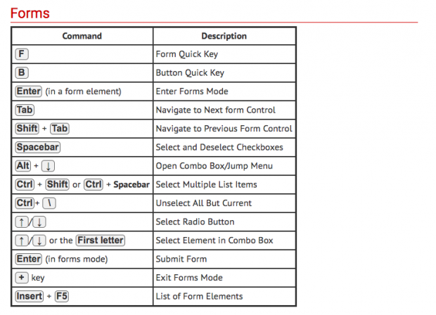
JAWS for instance has more than 80 keyboard shortcuts, but none of the users we spoke to knew them all.

Many assistive technology users rely heavily on Word or PDF as a helper application
Once an assistive technology user can find a rhythm that works for them, they tend to stick to it. For Dragon users this often means dictating their speech into a single long Word document, where it is easy to see and edit, and then transferring it into the various dialogue boxes in their web browser.
For JAWS users a dossier of case material prepared and saved into PDF was far easier to read than piecemeal material in various formats under a host of different tabs.
Less is more when it comes to content
While sighted users can see and scan through options quickly, screen reader users can only hear one at a time.
Try to make any content – including lists of options – as concise as possible so that it can be quickly understood. There is guidance on writing concise content on the GOV.UK Content Design Guidelines.
You scan, I scan
No one reads every word on every page. We’re looking for the gist. Screen reader users are no different. In fact experienced users often like to speed up the reading rate to 300 words per minute or more. This is their equivalent of scanning the page.
Lots of lines and global navigation create tedium and should allow for easy skipping, ideally in one go, for example with the ‘Skip Navigation’ link.
Links need to go somewhere
It sounds obvious, but with widgets and compartmentalised page content, clicking a link will often update just a section of the page. This is great for sighted users who will spot such a difference. But not for a screen reader user.
There are ways to avoid this issue. You could ensure that the new content is announced by the screen reader by using ARIA live regions or by moving focus to the updated content.
Designers and developers should implement the solution that provides the best user experience. This will depend on the particular design, content and functionality of the page.
Offer a linear and obvious layout
One of the screens we tested had been designed full of embedded, progressive logic. Each time a user answered a question, yet another nested level of questions appeared, depending on how they’d answered the previous question.
In a workshop full of stakeholders this probably seemed clever, but 3 levels in our screen reader users had no idea which question they were answering anymore.
Include integration with other software such as Word and Adobe Acrobat
Even if your system is web-based, if you are relying on other software, such as Word or PDF, for downloading or viewing material, you must include this in your testing.
In our testing, every Dragon user’s Word software crashed when they tried to download documents. With screen readers, pop-up dialogues to save/open docs in Word were ignored, leaving them stranded.
Problems experienced by assistive technology users are often also experienced by all users
When we tested with assistive technology users, we found them struggling with overly complex screens, missing key pieces of information and struggling to download and open documents.
We found exactly the same thing when we tested with people who weren’t using assistive technology. Testing with people who use assistive technology can be a quick and effective way of identifying issues that affect all users.
Making things more accessible makes things better for all users.
Test and test again
Our experience showed us that while an accessibility consultancy can highlight issues in your service, for example by catching out some areas where your code isn’t tagged for screen readers, they aren’t real users.
There is no ‘one size fits all’ way to know if what you’ve built will work until you test it with the people who will be expected to use it.
Read the Service Manual guidance on making your service accessible, testing with assistive technologies and running research sessions with people with disabilities.

